
ADA Compliance Checklist for Websites: Your 2025 Guide


In an era where digital presence is paramount, ensuring your website is accessible to everyone isn't just a best practice—it's a legal and ethical necessity. Digital accessibility lawsuits continue to rise, and audiences increasingly expect inclusive online experiences. This comprehensive ada compliance checklist for websites serves as your roadmap to not only mitigate legal risks but also to expand your reach to the one in four adults in the U.S. living with a disability.
- ADA website compliance covers eight critical areas from alt text and keyboard navigation to mobile accessibility.
- Meeting WCAG standards protects your business from lawsuits and opens your site to millions of users with disabilities.
- True accessibility is an ongoing commitment, not a one-time checklist exercise.
We'll break down the most critical components of the Web Content Accessibility Guidelines (WCAG), offering actionable steps and practical examples. Forget dense, technical jargon; this guide is designed for clarity and immediate implementation. You will learn precisely how to handle everything from alternative text for images and keyboard navigation to complex ARIA roles and video accessibility. For a comprehensive evaluation of your website's accessibility, consider engaging in a professional ADA review to identify and address specific compliance gaps.
Whether you're a developer, designer, or business owner, this checklist will empower you to build a website that truly welcomes all users. Following these guidelines enhances overall usability, improves your site's SEO performance, and strengthens your brand's reputation for inclusivity. Let's dive into the essential items that will make your website more accessible and compliant, starting with the fundamentals.
1. Alternative Text for Images
Alternative text, commonly known as "alt text," is a fundamental component of web accessibility. It is a brief, written description embedded in the HTML code of an image (<img alt="...">) that conveys its purpose and content to users who cannot see it. This is a critical element in any ADA compliance checklist for websites, as it provides a direct lifeline to individuals using screen readers, which convert on-screen content into spoken words or braille. Without alt text, an image becomes a void of information, leaving users with screen readers unable to understand the context or function of the visual element.
Why Alt Text is Essential
Effective alt text ensures that all users, regardless of visual ability, receive an equivalent experience. It's not just about describing what an image looks like; it's about communicating its function. For an e-commerce site, this could mean describing a product's key features. For a news article, it might mean explaining the significance of a photograph to the story.
Key Insight: Think of alt text as a replacement for the image. If the image were to disappear, the alt text should provide the user with the exact same information or function that the image was intended to convey.
Actionable Tips for Implementation
To properly implement alt text and enhance your website's accessibility, follow these best practices:
- Be Specific and Concise: Aim for under 125 characters. Describe the image's content and function clearly. For a product image, instead of "red shirt," use "Men's V-neck t-shirt in crimson red."
- Skip Redundant Phrases: Screen readers announce an element as an "image," so avoid starting your description with "Image of…" or "Picture of…" This creates a clunky, repetitive user experience.
- Use Empty Alt for Decorative Images: If an image is purely for aesthetic purposes and provides no informational value (like a background pattern or a stylistic border), use an empty alt attribute:
alt="". This signals screen readers to skip it, preventing unnecessary audio clutter. - Handle Complex Images: For intricate charts, graphs, or infographics, the alt text should provide a brief summary. Then, you must provide a full, detailed description in the nearby page text or via a link to a separate page.
- Logos as Links: If a logo is also a link to the homepage, the alt text should state the company name and its function, such as "BrandName, Inc. Home."
2. Keyboard Navigation and Focus Management
Ensuring a website is fully operable with a keyboard is a cornerstone of digital accessibility. Keyboard navigation allows users to access all interactive elements like links, buttons, and form fields without relying on a mouse. This capability is vital for individuals with motor disabilities, blind users who depend on screen readers, and even power users who prefer keyboard shortcuts. A crucial part of this is focus management, which involves providing a clear visual indicator of where the user is on the page (the "focus") and ensuring the navigation order is logical. This is an indispensable check on any ADA compliance checklist for websites.
Why Keyboard Navigation is Essential
Effective keyboard navigation ensures that no user is locked out of your website's functionality. For someone who cannot use a mouse, the keyboard is their primary means of interaction. A logical tab order allows them to move through the content sequentially, just as a sighted user would scan a page. Without visible focus indicators, a keyboard user is essentially navigating in the dark, unable to tell which element is currently active and ready to be clicked or engaged with.
Key Insight: True accessibility means that every action a user can perform with a mouse, from clicking a link to submitting a form, must be achievable using only a keyboard. The experience should be equivalent, not just possible.
Actionable Tips for Implementation
To implement robust keyboard navigation and focus management, integrate these best practices into your development and testing process:
- Test by Unplugging Your Mouse: The simplest test is to navigate your site using only the Tab (move forward), Shift+Tab (move backward), Enter, Spacebar, and arrow keys. If you get stuck or can't access a feature, you've found an issue.
- Ensure Visible Focus: Make sure the active element has a clear visual outline or highlight. This focus indicator must have at least a 3:1 contrast ratio against the background to be easily seen.
- Implement a "Skip to Main Content" Link: This should be the very first focusable element on a page. It allows keyboard users to bypass repetitive navigation menus and jump directly to the primary content.
- Manage
tabindexProperly: Usetabindex="0"to make non-interactive elements like custom-built<div>buttons focusable. Usetabindex="-1"to make an element focusable via script but remove it from the natural tab order. Avoid positivetabindexvalues as they disrupt the logical flow. - Trap Focus in Modals: When a modal dialog or pop-up appears, the keyboard focus must be trapped within it. Users should not be able to tab to elements in the background. When the modal is closed, focus must return to the element that triggered it.
- Use Semantic HTML: Native HTML elements like
<button>,<a>, and<input>are keyboard accessible by default. Prioritize them over custom<div>or<span>elements for interactive controls. This approach can even complement modern strategies; you can discover how accessible navigation aids voice search optimization.
3. Color Contrast Ratios
Color contrast is the difference in light between the foreground (e.g., text) and its background. This is a vital element in any ADA compliance checklist for websites, as it directly impacts readability for users with low vision, color blindness, and other visual impairments. Inadequate contrast can make text appear blurry or blend into the background, rendering your content inaccessible. The Web Content Accessibility Guidelines (WCAG) provide specific ratios to ensure content is legible for the widest possible audience.
Why Color Contrast is Essential
Strong color contrast ensures that your website is usable in various environments and by people with diverse visual abilities. For users with conditions like cataracts or those viewing a screen in bright sunlight, high contrast is not a preference but a necessity. By meeting established standards, you create a more comfortable and effective reading experience for everyone, preventing eye strain and ensuring critical information is not missed.
Key Insight: Good contrast isn't about creating stark, black-and-white designs. It’s about making thoughtful color choices that ensure clarity and readability while still aligning with your brand identity. A visually appealing site can and should also be an accessible one.
This quick reference summary box visualizes the minimum WCAG contrast ratios you need to meet.
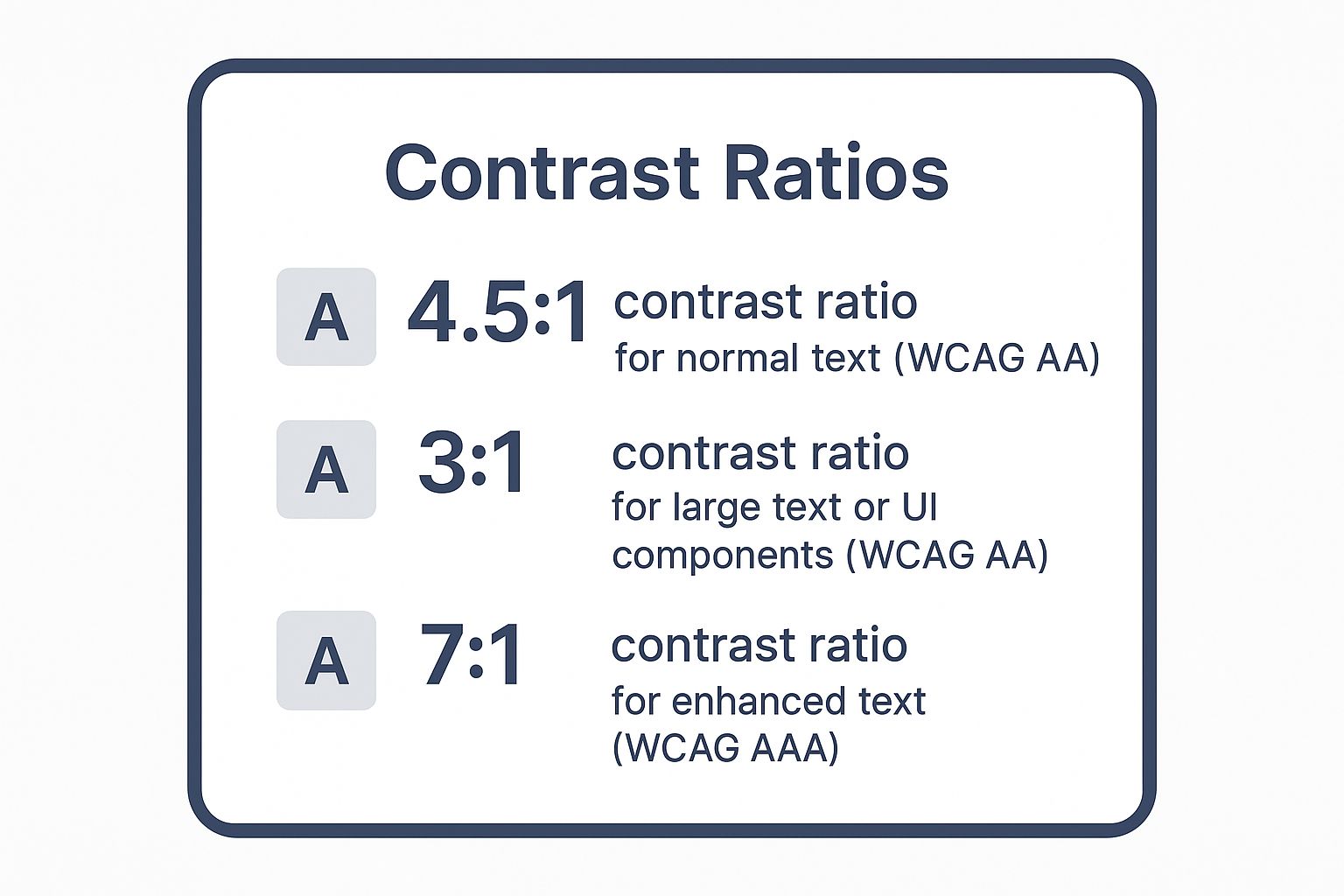
Meeting the 4.5:1 ratio for standard text is the most common and crucial target for achieving Level AA compliance.
Actionable Tips for Implementation
To ensure your website's color palette is accessible and compliant, integrate these best practices into your design and testing process:
- Use Testing Tools: Regularly check your color combinations with online tools like the WebAIM Contrast Checker or browser developer tools. These provide instant pass/fail feedback for WCAG AA and AAA levels.
- Avoid Problematic Combinations: Be wary of common accessibility failures, such as light gray text on a white background, or placing text over busy background images without sufficient protection.
- Plan for Text on Images: When overlaying text on images, ensure readability by adding a solid color block, a semi-transparent overlay, or a text shadow to create the necessary contrast against the varied background.
- Check Brand Colors: Don't assume your brand colors are compliant. If a primary brand color fails contrast tests for text, consider creating a darker, accessible-approved shade for use in text and on interactive elements.
- Don't Rely on Color Alone: Never use color as the only way to convey information or indicate an action. For example, supplement a red error message with an icon and a descriptive text label to ensure all users understand its meaning.
4. Semantic HTML Structure and Headings
Semantic HTML is the practice of using HTML elements that clearly describe their own meaning and purpose to both browsers and assistive technologies. Instead of using generic containers like <div> and <span> for everything, semantic HTML provides specific tags like <header>, <nav>, <main>, and <article>. This creates a logical, predictable, and navigable structure, which is a cornerstone of any effective ADA compliance checklist for websites. For a screen reader user, this structure acts as a digital map, allowing them to understand the page layout and jump directly to relevant sections without having to listen to every single word.

Why Semantic Structure is Essential
A well-organized heading hierarchy (<h1> through <h6>) and semantic landmarks create an accessible and user-friendly outline of your content. This allows screen reader users to quickly grasp the main topics and navigate to the information they need, much like a sighted user might scan visual headings on a page. Websites like Wikipedia and the GOV.UK design system master this by enforcing strict semantic and heading structures, making vast amounts of information digestible for all users. A logical structure significantly improves the user experience for everyone, not just those using assistive technology.
Key Insight: Think of your webpage's heading structure as its table of contents. If you were to list only the headings in order, they should form a coherent and logical outline of the entire page's content.
Actionable Tips for Implementation
To implement a robust semantic structure and improve your website's accessibility, follow these best practices:
- Follow Heading Hierarchy: Use a single
<h1>for the main page title. Subheadings should follow a logical sequence (<h2>, then<h3>, etc.) without skipping levels. Do not choose headings based on their visual appearance; use CSS for styling instead. - Utilize Semantic Landmarks: Wrap your main content in a
<main>tag. Use<nav>for primary navigation blocks,<header>for the top of the page,<footer>for the bottom, and<aside>for complementary content like sidebars. - Prefer Semantic Elements: Before using a generic
<div>, ask if a more specific element exists. Use<button>for interactive buttons,<article>for self-contained content like a blog post, and<section>to group related content. - Visualize Your Structure: Use browser extensions like "HeadingsMap" to see a visual outline of your page's heading structure. This quickly reveals any illogical order or skipped levels. You can learn more about the critical role of semantic HTML in ADA compliance and its impact on user navigation.
- Test with a Screen Reader: The best way to understand the impact of your site's structure is to experience it yourself. Use a screen reader to navigate your page using only the headings and landmarks to see if it makes sense.
5. Form Labels and Input Accessibility
Accessible web forms are the gateway to user interaction, whether for making a purchase, signing up for a newsletter, or submitting an inquiry. Form accessibility ensures that all users, including those relying on screen readers or other assistive technologies, can understand, navigate, and successfully complete forms. This is a non-negotiable part of any ADA compliance checklist for websites, as inaccessible forms create significant barriers, effectively blocking users from engaging with key services. It involves programmatically linking labels to their corresponding input fields, providing clear instructions, and managing errors in a way that is helpful and easy to understand.
Why Accessible Forms are Essential
When a form lacks proper labels, a screen reader user hears only a series of unassociated input fields ("edit text," "edit text," "checkbox"), making it impossible to know what information is required. Accessible forms, like those championed by the UK Government Digital Service (GDS), create a seamless and logical experience. They guide users through each step, clearly identify required information, and provide constructive feedback when mistakes are made, preventing frustration and abandonment.
Key Insight: An accessible form is like a good conversation. It clearly asks for information, listens to the user's input, and offers helpful guidance if something is unclear. It never leaves the user guessing what to do next.
Actionable Tips for Implementation
To ensure your web forms are fully accessible and compliant, integrate these critical practices into your design and development process:
- Explicitly Associate Labels: Always use the
<label>element with theforattribute, linking it to theidof the corresponding<input>. Example:<label for="email">Email Address</label><input type="email" id="email">. - Indicate Required Fields Clearly: Don't rely solely on color or an asterisk. Include the word "(required)" directly within the
<label>element. This ensures all users understand which fields are mandatory. - Provide Accessible Error Messages: When an error occurs, use
aria-describedbyto programmatically link the error message to the specific input field. Also, setaria-invalid="true"on the field so assistive technology can announce the error state. - Avoid Placeholder Text as Labels: Placeholder text disappears once a user starts typing and often has poor color contrast. It should only be used for supplemental hints, never as the primary label.
- Group Related Controls: Use
<fieldset>to group related inputs like radio buttons or a set of checkboxes, and use<legend>to provide a descriptive title for the entire group. This gives context to screen reader users. - Use Autocomplete Attributes: Help users fill forms faster and with fewer errors by implementing
autocompleteattributes (e.g.,autocomplete="name",autocomplete="email"). This is especially helpful for users with cognitive or motor impairments.
6. ARIA (Accessible Rich Internet Applications) Implementation
Accessible Rich Internet Applications (ARIA) is a technical specification from the W3C that provides a set of attributes to make web content and applications more accessible. It works by supplementing HTML, allowing developers to add roles, states, and properties to elements, especially for dynamic content and custom user interface controls created with JavaScript. As a key part of any ADA compliance checklist for websites, ARIA bridges the accessibility gap where native HTML semantics fall short, providing crucial context to assistive technologies like screen readers.
Why ARIA is Essential
Modern websites are rarely static. They feature complex components like custom drop-down menus, sliders, tab panels, and live-updating content feeds. Native HTML elements often lack the ability to communicate the function or current state of these widgets. ARIA provides the necessary vocabulary for screen readers to understand and announce that a component is a "menu" that is currently "expanded," or that new content has just loaded in a "live region." Without it, users of assistive technology can be completely locked out of a site's core functionality.
Key Insight: The first and most important rule of ARIA is: "No ARIA is better than bad ARIA." Only use ARIA when a native HTML element or attribute cannot provide the required semantics. For example, always use a
<button>element instead of a<div role="button">.
Actionable Tips for Implementation
To implement ARIA correctly and avoid making your site less accessible, adhere to these critical guidelines:
- Prioritize Native HTML: Before reaching for ARIA, always check if a standard HTML element can do the job. A native
<button>or<input type="checkbox">already comes with built-in accessibility for keyboard and screen readers. - Provide Accessible Names: Use
aria-labelto provide a name for an element when no visible text is available (e.g., an icon-only button). Usearia-labelledbyto link an element to another element on the page that serves as its label. - Announce Dynamic Changes: Implement
aria-live="polite"to have screen readers announce non-urgent updates, like new search results appearing. Usearia-live="assertive"for critical alerts that demand immediate user attention, such as an error message. - Communicate States and Properties: Use attributes like
aria-expanded="true/false"on collapsible sections or menus to indicate their state. Usearia-current="page"to identify the current page in a navigation menu. - Follow Established Patterns: For complex widgets like carousels, modals, or tab panels, consult the WAI-ARIA Authoring Practices Guide. It provides proven design patterns and keyboard interaction models to ensure a predictable and accessible user experience.
7. Video and Audio Accessibility
As multimedia becomes a dominant form of online communication, ensuring that video and audio content is accessible is non-negotiable. This means providing alternatives for users who are deaf, hard of hearing, blind, or have other sensory disabilities. This element is a cornerstone of any modern ADA compliance checklist for websites, as it guarantees that your message reaches everyone, regardless of how they consume content. Without these alternatives, your videos and podcasts create insurmountable barriers, excluding a significant portion of your audience.
Why Video and Audio Accessibility is Essential
Accessible multimedia ensures that information conveyed through sound or visuals is equally available through text or alternative audio tracks. For a user who is deaf, synchronized captions are the only way to understand dialogue and important sound cues. For a user who is blind, an audio description is the only way to comprehend critical on-screen action or text. By implementing these features, you transform a one-dimensional piece of content into a universally accessible experience.
Key Insight: Accessibility for multimedia isn't an add-on; it's a parallel form of communication. Your captions, transcripts, and audio descriptions must convey the same level of detail and nuance as the original media.
Actionable Tips for Implementation
To make your multimedia content compliant and user-friendly, integrate these best practices:
- Provide Synchronized Captions: Captions must be accurate and timed to appear with the spoken audio. Use a format like WebVTT and ensure they include speaker identification and important non-speech sounds, such as "[door slams]" or "[dramatic music]." YouTube and Coursera are excellent examples of platforms that provide robust captioning.
- Offer Audio Descriptions: For video content, an audio description is a separate audio track that narrates key visual information during natural pauses in the dialogue. This includes describing actions, settings, and on-screen text that are essential to understanding the content.
- Include Full Transcripts: A text transcript is a complete script of the audio content, including dialogue and sound descriptions. It benefits users who are deaf-blind and also serves as an SEO-friendly text alternative. Many platforms, like TED Talks, provide interactive transcripts alongside their videos.
- Ensure Keyboard Accessibility: All media player controls, such as play, pause, volume, and captions, must be fully operable using only a keyboard. Avoid players that rely solely on mouse interaction.
- Do Not Autoplay Content: Autoplaying audio can interfere with screen readers, disorienting users. If a video must autoplay, it should be muted by default and provide a clear, accessible control to initiate sound. The advantages of using video are immense, but only when every user can control their experience. To dive deeper, explore the many powerful benefits of video marketing for your brand.
8. Mobile and Touch Accessibility
With the majority of web traffic originating from mobile devices, ensuring your site is accessible on smartphones and tablets is non-negotiable. Mobile and touch accessibility involves designing websites to function effectively for users with disabilities on touchscreen devices. This extends beyond simple responsive design, encompassing adequate touch target sizes, support for platform-specific accessibility features like screen readers, and providing alternatives to complex, motor-skill-dependent gestures. For any modern ADA compliance checklist for websites, this is a critical focus, as a failure here can exclude a vast audience.
Why Mobile Accessibility is Essential
Mobile accessibility addresses the unique challenges of smaller screens and touch-based interaction. Users with motor impairments, for instance, may struggle with small, clustered buttons, while those with low vision rely on zoom functionality that developers sometimes disable. Effective mobile design ensures that interactive elements are easy to target and that the experience is seamless for users who rely on assistive tools like Apple's VoiceOver or Android's TalkBack. To fully grasp the broader impact, delve into how text-to-speech technology for individuals with disabilities works on these devices, a critical component of ADA compliance.
Key Insight: Mobile accessibility isn't just about your website looking good on a small screen. It's about ensuring every interactive element is usable by someone with limited motor control, low vision, or who navigates entirely by voice and screen reader commands.
Actionable Tips for Implementation
To ensure your website is fully accessible on mobile and touch devices, integrate these best practices into your design and development workflow:
- Enlarge Touch Targets: All interactive elements like buttons and links should have a touch target size of at least 44×44 pixels. This prevents accidental taps for users with motor difficulties.
- Provide Ample Spacing: Ensure there is sufficient space between interactive elements to avoid errors. A buffer of at least 8 pixels between touch targets is a good starting point.
- Never Disable Zoom: Users with low vision rely on pinch-to-zoom. Do not use
maximum-scale=1.0oruser-scalable=noin your viewport meta tag, as this removes a fundamental accessibility feature. - Provide Gesture Alternatives: Do not rely solely on complex gestures like swiping or pinching for core functionality. Always provide a simple, tappable button alternative. For example, a "Next" button should accompany a swipe-to-advance image carousel.
- Test with Mobile Screen Readers: Manually test your site's navigation and functionality using both VoiceOver on iOS and TalkBack on Android to identify real-world usability issues.
- Support Both Orientations: Ensure your website's layout and functionality are preserved and fully usable in both portrait and landscape modes.
8-Point ADA Website Compliance Checklist
| Accessibility Feature | Implementation Complexity 🔄 | Resource Requirements ⚡ | Expected Outcomes 📊 | Ideal Use Cases 💡 | Key Advantages ⭐ |
|---|---|---|---|---|---|
| Alternative Text for Images | Low to Medium – writing descriptive text is straightforward but time-consuming for large image sets | Moderate – requires careful image review and ongoing updates | Improved accessibility for screen reader users and SEO benefits | Websites with many images, e-commerce, news sites | Enhances accessibility; required by WCAG Level A; aids SEO and fallback content |
| Keyboard Navigation and Focus Management | Medium to High – complex UI components and custom widgets add complexity | High – needs thorough JS development and cross-browser testing | Full keyboard operability improving usability for motor-impaired and power users | Interactive applications, dashboards, SPAs | Essential for non-mouse users; reveals hidden accessibility flaws; boosts efficiency |
| Color Contrast Ratios | Low – color choices and contrast checks can be automated and enforced early | Low – mainly design and testing tools | Significantly improved readability and usability across conditions | All websites, especially content-rich and branding-sensitive | Benefits vision-impaired users; reduces eye strain; simple fixes with big impact |
| Semantic HTML Structure and Headings | Low to Medium – requires disciplined markup and developer training | Low – mostly front-end code restructuring | Superior navigation for screen readers; better SEO; maintainable code | Content-heavy sites, blogs, articles, documentation | Enhances navigation; improves SEO; creates logical document outlines |
| Form Labels and Input Accessibility | Medium – requires proper labeling, error management, and validation logic | Moderate – dev effort for error handling and testing | Reduced form abandonment; improved accessibility and form usability | All forms, registration, checkout, surveys | Clear labels aid screen readers; error messages reduce user frustration |
| ARIA Implementation | High – requires detailed knowledge and precise use to avoid pitfalls | High – significant development and testing effort | Enables accessibility of custom widgets and dynamic content | Complex dynamic apps, custom controls, SPAs | Bridges gaps in native HTML; crucial for advanced UI components |
| Video and Audio Accessibility | Medium to High – requires captioning, description, and accessible player features | High – professional captioning and ongoing upkeep | Accessible multimedia benefiting deaf, hard of hearing, and blind users | Educational videos, streaming platforms, multimedia sites | Empowers diverse users; improves SEO; complies with WCAG media guidelines |
| Mobile and Touch Accessibility | Medium – needs design and development adjustments for touch targets and gestures | Moderate – device testing and responsive design | Better usability on mobile devices for users with dexterity issues | Mobile apps, responsive websites | Improves mobile user experience; supports assistive tech; prevents accidental taps |
Moving Beyond the Checklist: Partnering for Lasting Accessibility
Navigating this comprehensive ADA compliance checklist for websites is a monumental first step toward creating a more inclusive digital experience. You have explored the critical pillars of accessibility, from providing alternative text for images to ensure visual information is accessible to all, to implementing robust keyboard navigation that empowers users who cannot rely on a mouse. Each item on this list represents a crucial bridge connecting your content to a wider, more diverse audience.
We delved into the technical yet vital aspects of semantic HTML and proper heading structures, which form the very skeleton of an accessible site. We also highlighted the importance of clear form labels and sufficient color contrast, small details that make a world of difference in user experience and usability. Finally, we touched upon advanced concepts like ARIA roles for dynamic content and ensuring multimedia is accessible through captions and transcripts. These elements are not just compliance requirements; they are the building blocks of a truly user-centric website.
From Checklist to Culture: The Ongoing Journey of Accessibility
The most critical takeaway is that accessibility is not a one-and-done project. It is an ongoing commitment, a cultural shift in how you approach web design and content creation. The digital world is in constant flux, with new technologies, design patterns, and updated Web Content Accessibility Guidelines (WCAG) emerging regularly. Treating this checklist as a final exam to be passed and forgotten is a recipe for falling out of compliance and, more importantly, failing your users.
Instead, view this guide as the foundation of a continuous improvement cycle. True digital inclusion requires embedding accessibility into your organization’s DNA.
Here are your actionable next steps to move beyond the initial audit:
- Schedule Regular Audits: Plan for quarterly or bi-annual accessibility audits. Use a combination of automated tools for broad scans and manual testing with assistive technologies to catch nuanced issues.
- Integrate Accessibility into Your Workflow: Make accessibility a non-negotiable part of your design and development process. From the initial wireframe to the final QA check, accessibility considerations should be present at every stage.
- Train Your Team: Equip your content creators, designers, and developers with the knowledge they need. Ongoing training ensures that new content and features are born accessible, preventing the need for costly remediation down the line.
The True Value of an Accessible Website
Mastering the concepts in this ada compliance checklist for websites delivers value far beyond mitigating legal risks. An accessible website is inherently a more usable website for everyone. The principles of clear navigation, readable text, and logical structure that benefit users with disabilities also enhance the experience for mobile users, individuals with slow internet connections, and even older adults.
By prioritizing accessibility, you are not just checking boxes; you are expanding your market reach, strengthening your brand reputation, and demonstrating a powerful commitment to corporate social responsibility. You are telling an entire segment of the population that their experience matters and that they are welcome in your digital space. This fosters loyalty and opens your business to an estimated one in four adults in the U.S. who live with a disability, a community with significant spending power.
Embracing accessibility is an investment in a better web and a stronger business. It transforms your website from a simple digital brochure into an inclusive, powerful tool that serves every potential customer, client, and partner with dignity and respect.
Ready to turn your accessibility goals into reality without the guesswork? The team at Site Igniters specializes in comprehensive website audits and implementing lasting ADA and WCAG compliance solutions, protecting your business and expanding your reach. Let us be your expert partner in building a truly inclusive digital presence.
Seth Sanders is the founder of Site Igniters, a digital marketing agency in El Dorado Hills, California.