
How to Optimize Website for Mobile: Quick Guide


Optimizing your site for mobile isn't just one thing. It's a combination of nailing responsive design, getting lightning-fast page speeds, and crafting a seamless user experience. You have to start thinking mobile-first, which means compressing images, radically simplifying your navigation, and making sure every single button and link is easy to tap on a small screen.
- Mobile optimization requires responsive design, fast page speeds, and a simplified user experience working together.
- Compressing images, simplifying navigation, and designing for touch are the highest-impact mobile improvements.
- Google uses mobile-first indexing, so your mobile site directly determines your search rankings.
Why Mobile Optimization Is a Business Imperative
Let's be blunt: if your website isn't built for the person holding a smartphone, you're actively pushing customers—and their money—out the door. Thinking about mobile optimization isn't some forward-thinking strategy anymore. It's a basic requirement for staying in business.
The numbers don't lie. Mobile devices are on track to drive nearly 63% of all global web traffic by 2025. Desktops? Their share is shrinking to just over 35%. This isn't just about browsing, either. A staggering 44.2% of all retail eCommerce sales in the U.S. will happen on a mobile device. That tells you everything you need to know about where your customers are.
The Real-World Cost of a Poor Mobile Experience
Ignoring this shift has real, painful consequences. Picture an e-commerce store with a clunky checkout on mobile. A customer is ready to buy, but they're stuck pinching and zooming, trying to jab at tiny form fields with their thumb. What happens? They give up, abandon the cart, and you lose the sale.
It's the same for a local service business. You could lose a hot lead simply because your contact form is a mess or the click-to-call button doesn't work on their phone. This isn't a small hiccup; it's a major leak in your sales funnel. Every bit of friction chips away at trust and sends people running to your competitors who've figured this out.
This is especially true for local businesses. A great mobile site is just as important as having a perfectly optimized https://siteigniters.com/how-to-optimize-google-my-business-2018/ profile.
"A slow or confusing mobile website doesn't just cost you a visitor; it damages your brand's reputation. Users associate a frustrating digital experience with the quality of your products or services, creating a negative perception before they even engage with what you offer."
To truly get this right, you need to understand that mobile and desktop users aren't just using different devices; they have entirely different mindsets and needs.
Mobile vs Desktop User Expectations
This table highlights the crucial differences in how users interact with websites on mobile versus desktop, guiding your optimization priorities.
| Aspect | Mobile User Expectation | Desktop User Expectation |
|---|---|---|
| Goal | Quick, task-oriented (find info, make a call, buy) | In-depth research, browsing, comparison |
| Attention Span | Extremely short, easily distracted | Longer, more focused and patient |
| Connection | Often on slower cellular or public Wi-Fi | Typically stable, high-speed connection |
| Input Method | Touchscreen (thumbs), voice commands | Keyboard and mouse for precise control |
| Screen Size | Small, vertical orientation | Large, horizontal orientation |
Thinking about these differences is the first step toward building an experience that actually works for your audience, not against them.
Google's Mobile-First Indexing Changes Everything
If losing customers isn't enough to convince you, maybe this will: Google now operates on a mobile-first indexing system. This means Google primarily looks at the mobile version of your website to decide how to rank it in search results.
So, if your mobile site is a watered-down, slow, or broken version of your desktop site, your search rankings will tank everywhere—even for people searching on a desktop.
This is why learning how to make your website mobile-friendly is non-negotiable for any serious SEO strategy. A bad mobile site tells Google your site offers a poor user experience, leading to lower rankings, less organic traffic, and a hit to your bottom line.
In the eyes of the world's biggest search engine, your mobile site is your main site. Period.
Building a Truly Responsive Web Design
A genuinely responsive web design does more than just shrink your content to fit a smaller screen; it completely adapts the user experience for the device. This is a non-negotiable starting point if you're serious about optimizing your website for mobile. A site that just resizes everything often leaves you with microscopic text and buttons that are impossible to tap.
The secret sauce behind a great responsive design is flexibility. It all comes down to three key ingredients working together: a fluid grid, flexible images, and media queries.
Think of the fluid grid as an elastic skeleton for your website. It allows columns and other elements to stretch or shrink depending on the screen size. Flexible images ensure your visuals scale right along with the grid, so they never break the layout or look distorted.
Media queries are the brains of the whole operation. They're simple rules in your CSS that check the device's screen width or orientation and then apply specific styles. For example, a media query can tell a browser to stack content into a single column or bump up the font size once the screen width drops below a certain point, like 768 pixels.

Designing for Thumbs
One of the most overlooked parts of mobile design is simple ergonomics. Most people hold and navigate their phones with their thumbs, which creates a natural "thumb zone"—the area of the screen they can comfortably reach. If you place your most important buttons outside this zone, you're forcing users into awkward hand gymnastics.
To create a truly thumb-friendly interface, you need to:
- Place primary navigation and call-to-action buttons near the bottom or middle of the screen where they're easy to reach.
- Make sure there’s plenty of space around clickable elements to prevent frustrating mis-taps. The common wisdom is to make tap targets at least 48×48 pixels.
- Use slide-out menus or "hamburger" icons to keep the main interface clean while keeping navigation just a tap away.
A design isn't finished until it feels effortless to the user. On mobile, that means prioritizing one-handed usability and placing key actions within easy thumb reach. Anything less introduces unnecessary friction.
Prioritizing Mobile Readability
What looks crisp and clear on a 27-inch monitor can be a jumbled, unreadable mess on a phone. Optimizing your text is absolutely critical for keeping people engaged and stopping them from hitting the back button in frustration. Small, cramped text is a conversion killer.
Focus on these key areas for your typography:
- Font Size: A base font size of 16px is the gold standard for body text on mobile. It’s legible enough that users won't have to pinch-and-zoom.
- Line Spacing: Aim for a line-height of around 1.5 times the font size. This gives your paragraphs enough breathing room to be easily scannable.
- Contrast: Ensure there’s high contrast between your text and background colors. This is a must for accessibility and makes your content easier to read in different lighting, from a dark room to bright sunlight.
When you combine these technical pieces with a user-first focus on ergonomics and readability, your responsive design goes from being merely functional to genuinely effective. It becomes a powerful tool that respects the user's context, making your site a pleasure to use on any device.
How to Drastically Improve Your Mobile Page Speed
When it comes to your mobile site, speed isn't just a feature—it's the entire experience. Every single millisecond matters. Think about this: 53% of mobile users will ditch a page if it takes longer than three seconds to load. Those aren't just lost clicks; they're lost customers and a hit to your brand's reputation.
The hard truth is mobile devices have less powerful processors and often rely on spotty network connections. A site that feels lightning-fast on your desktop can feel like it's crawling through mud on a smartphone. And with more than 55% of global website traffic now coming from mobile, you just can't afford a sluggish site. If you want to dive deeper into how mobile is shaping the web, check out the great insights on mobile website design best practices from Webstacks.
This infographic maps out a clear path to giving your mobile site a serious speed boost.
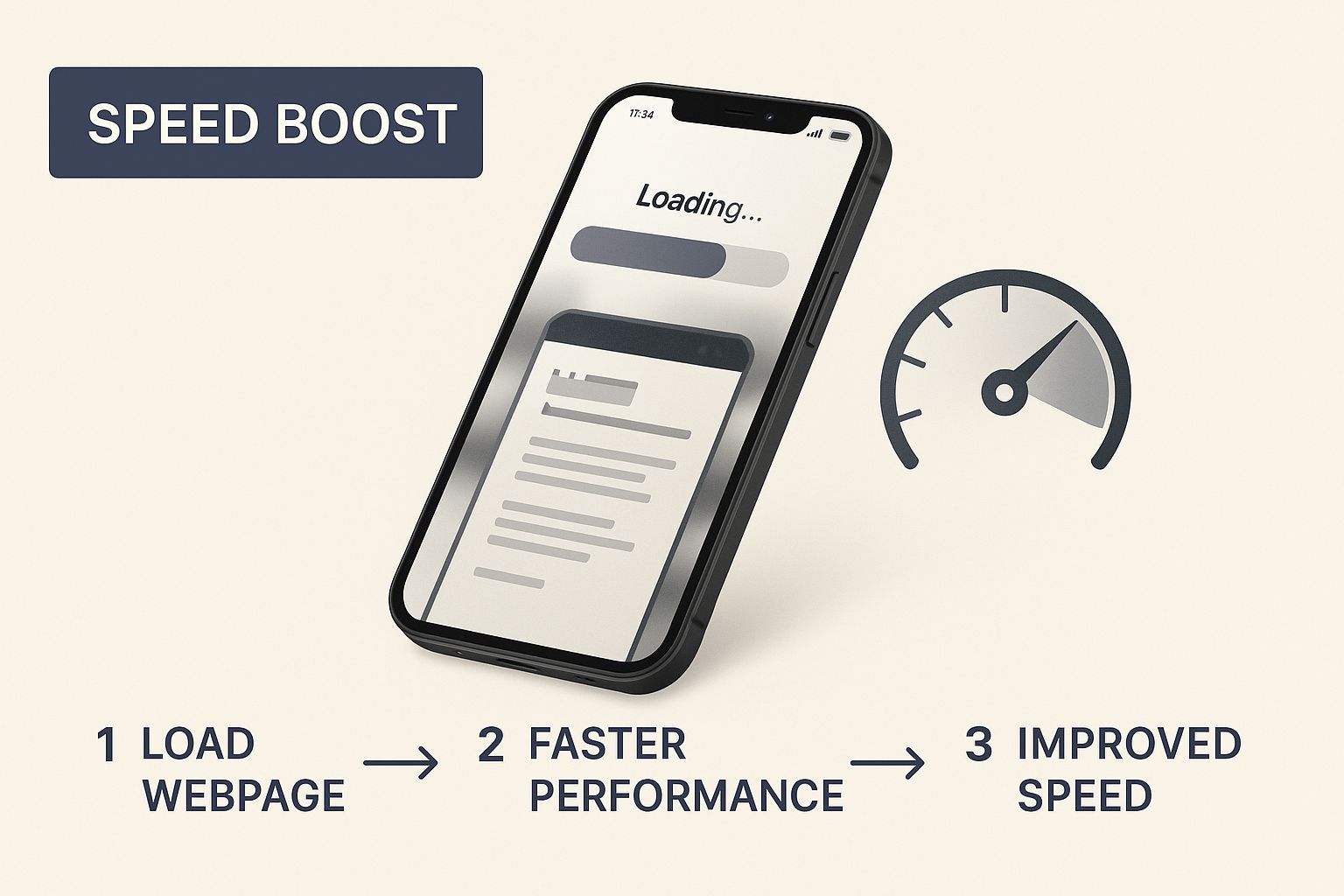
By breaking down the key steps, you can see exactly how things like optimizing images and using delivery networks turn into faster load times and a much happier user.
Start with Smart Image Optimization
Images are, hands down, the biggest culprits behind slow mobile pages. I've seen massive, unoptimized image files single-handedly grind a site to a halt. The trick is to shrink those file sizes without turning your crisp visuals into a pixelated mess.
Here’s a quick checklist to get your images in shape:
- Compression is Key: Before you even upload an image, run it through a tool like TinyPNG or ImageOptim. These programs strip out unnecessary data, making the file significantly smaller with almost no noticeable drop in quality.
- Use Next-Gen Formats: It’s time to move on from old-school JPEGs and PNGs. Modern formats like WebP offer much better compression, often creating files that are 25-30% smaller without sacrificing quality.
- Size Them Correctly: This one seems obvious, but it's a common mistake. Never upload a giant 2000-pixel-wide image if it's only going to be displayed in a 300-pixel container on mobile. Resize your images to the exact dimensions needed before you upload them.
Your users on a spotty 4G connection don't care about your high-resolution hero image. They care about getting the information they need now. Always prioritize speed by serving images that are meticulously optimized for the mobile context.
Leverage Caching and Minification
It's not just about the images. The very code that builds your website—HTML, CSS, and JavaScript—can also add unnecessary weight. Two of the most powerful techniques to fix this are caching and minification.
Browser Caching is like giving a visitor's browser a temporary memory of your site. It tells the browser to store static files—like your logo, stylesheets, and scripts. When that user comes back or visits another page, their browser can load those files locally instead of downloading them all over again. The result? Much faster load times on subsequent visits.
Minification, on the other hand, is all about trimming the fat from your code. It's a process that removes all the characters a browser doesn't need to read, like white space, comments, and line breaks. While these things help developers, they just add to the file size. Minifying your code makes the files smaller, quicker to download, and easier for the browser to process.
Use a Content Delivery Network
A Content Delivery Network (CDN) is one of the single most effective upgrades you can make for mobile speed, especially if you have a global audience. A CDN is essentially a network of servers spread across the globe.
It works by storing cached copies of your website's content in all of these different locations. When someone visits your site, the CDN serves them the content from the server that's geographically closest to them. This drastically cuts down on latency—the time it takes for data to travel. For any business with customers in different cities or countries, a CDN is a no-brainer. It ensures everyone gets a consistently fast experience, no matter where they are.
Crafting a Flawless Mobile User Experience
Getting visitors to your site with blazing-fast load times is only half the battle. An intuitive user experience (UX) is what convinces them to stick around. After all the work you've put into speed, the last thing you want is for someone to leave out of sheer frustration.
Crafting a great mobile UX really comes down to anticipating what your users need and bulldozing every possible point of friction out of their way.
You have to start by recognizing just how differently people behave on their phones. They're often distracted, trying to do things with one hand, and they want to accomplish a specific goal right now. Your site's design absolutely must respect this context by making every single interaction simple and predictable. If a user has to stop and think about how to find something, you've already failed.

Simplify Navigation and Forms
Those complex, multi-level menus that look great on a desktop? They’re a complete disaster on mobile. Users just don't have the patience to drill down through endless subcategories. The goal is to get them where they want to go in as few taps as possible.
- Embrace the Hamburger Menu: Consolidate your navigation into that clean, recognizable hamburger icon (☰). It's a massive screen space saver.
- Limit Your Menu Items: Your main navigation should only feature 4-6 essential categories. Anything more is just overwhelming.
- Make Search a Priority: For sites with a lot of content, a prominent, easy-to-tap search bar is more valuable than any menu you can design.
This principle of simplicity is even more critical when it comes to forms. Let's be honest—filling out forms on a phone is a pain. Keep them short by only asking for what's absolutely necessary. Use features like autofill and larger text fields to make the process as painless as you can.
Avoid the Dreaded Fat Finger Problem
One of the most common—and infuriating—mobile UX failures is creating clickable elements that are too small or packed too closely together. This "fat finger" problem, where users accidentally tap the wrong link, is a recipe for frustration. It leads to errors, backtracking, and, more often than not, abandonment.
Make sure every button, link, and interactive element is large enough to be tapped accurately without needing to zoom in. A good rule of thumb is to make your tap targets at least 48×48 pixels, with plenty of white space separating them from other elements.
This isn't just a design preference; it's a cornerstone of accessibility. Making your site easy for everyone to navigate, regardless of physical ability, is non-negotiable. You can dive deeper into creating an inclusive experience by exploring our guide on ADA website compliance. Proper target sizing is a key piece of that puzzle.
Streamline the Path to Conversion
Every single step in your conversion process—whether it's a purchase, a signup, or a contact form submission—is an opportunity for a user to give up. On mobile, that path has to be ruthlessly streamlined. A checkout process that takes seven steps on a desktop needs to be condensed to three or four, max.
The data backs this up. Mobile devices now drive about 59.7% of all global web traffic, yet mobile bounce rates are consistently higher than on desktop. This tells us that while users are overwhelmingly on their phones, their tolerance for a bad experience is incredibly low. For a full breakdown, check out the latest research on mobile device website traffic statistics from Tekrevol.
By simplifying navigation and making every tap feel effortless, you directly attack the core reasons users bounce. You turn what could have been a moment of frustration into a successful conversion.
Diving into Advanced Mobile SEO and Technical Audits
Alright, you've got a fast, responsive, and user-friendly mobile site. That's a huge win, but now it's time to dig into the technical nitty-gritty that really separates you from the pack in search results.
This is where advanced mobile SEO and regular technical audits come in. Think of this as going beyond the surface-level stuff and into the structural elements that Google scrutinizes. It’s how you make sure the search engine doesn't just see your site, but actually rewards it.
A big part of this is knowing how to perform a comprehensive website audit. This process is your secret weapon for uncovering those hidden issues that, while not obvious, can seriously drag down your mobile-first indexing score.
Nail Your Mobile Viewport Configuration
One of the very first technical checks I always make is the mobile viewport. It's a tiny snippet of code in your site's header, but its impact is massive. It basically tells mobile browsers how to scale your page and control its dimensions.
Get it wrong, and mobile browsers will try to render your page at a full desktop width. The result? Your visitors are forced to pinch and zoom just to read your content—a classic sign of a non-mobile-friendly site.
Here's the fix. Make sure this exact meta tag is sitting in the <head> section of your HTML:
<meta name="viewport" content="width=device-width, initial-scale=1.0">
This little line ensures the page width automatically matches the device's screen, giving users a seamless, responsive experience from the second they land on your site.
Use Structured Data to Snag Rich Snippets
Structured data, usually through Schema markup, is code that does more than just tell search engines what your content is about—it explains the context. When you implement it correctly, Google can display your pages with rich snippets.
Think of those enhanced search results with star ratings, prices, or FAQ dropdowns. On a cramped mobile search results page, these snippets are gold. They make your listing pop and can seriously boost your click-through rates.
For an e-commerce site, this is a no-brainer. A product page with proper schema can show off:
- Star ratings and the total number of reviews
- Current price and stock availability
- Product photos right there in the search results
These visual hints are incredibly effective for grabbing the attention of mobile users who are scanning for quick answers. It’s also a foundational piece as you optimize your website for voice search, because smart assistants rely heavily on this data to pull direct answers.
Don’t just tell Google what your page is about—show it. Structured data transforms a simple blue link into an informative, eye-catching result that answers a user's query before they even click.
Ditch the Intrusive Pop-ups and Interstitials
Google couldn't be clearer on this one: intrusive interstitials are bad for the mobile user experience. We're talking about those annoying pop-ups that completely cover the content, blocking users from what they came to see.
Ever since 2017, Google has been penalizing sites that use them aggressively on mobile devices.
Your technical audit should have a specific checkpoint to hunt down any pop-ups that are tough to close or that cover most of the screen right after a user lands on your page. Sure, small banners for cookie consent or legally required age verification are fine. But that full-screen "Subscribe to our newsletter!" pop-up? That’s got to go. Killing these is a straightforward way to improve both user experience and your mobile search performance.
Common Mobile Optimization Questions Answered
When you start digging into a mobile optimization project, a few key questions always seem to pop up. Getting clear, straightforward answers is the best way to make smart decisions, whether you're just getting started or fine-tuning an existing strategy.
Let's cut through the noise and tackle some of the most frequent hurdles people run into.
One of the biggest points of confusion is the difference between responsive design and having a separate mobile site. It’s actually pretty simple: responsive design means you have just one website that automatically adjusts its layout to fit any screen, from a giant monitor to the smallest smartphone.
A separate mobile site, often found on a subdomain like m.example.com, is a totally different, stripped-down version of your website built only for mobile.
Hands down, responsive design is the way to go. It's what Google and just about every industry expert strongly recommends. Why? Because it's way easier to manage, avoids tricky SEO problems like duplicate content, and gives your users a much more consistent experience no matter how they find you.
How to Check if Your Website is Mobile-Friendly
So, how can you tell if your current site is making the grade?
Your first stop should be Google’s official Mobile-Friendly Test tool. It gives you a quick pass-or-fail verdict and will flag any major problems right away.
For a more hands-on look, you can use the developer tools built right into browsers like Chrome. Just right-click anywhere on your page and hit "Inspect." This powerful feature lets you see exactly how your site looks and behaves on all sorts of different phone and tablet models. It's the perfect way to spot subtle layout breaks or check if your buttons are actually big enough for someone to tap with their thumb.
Optimizing your site for mobile rarely hurts its desktop performance—in fact, it almost always helps. Core mobile optimization tasks like compressing images, minifying code, and leveraging browser caching are universal speed boosters that create a faster, more efficient experience for every visitor, regardless of their device.
At the end of the day, the goal isn't to build a "mobile site" and a "desktop site." It's to build one universally awesome website that just works for everyone. When you focus on mobile-first principles, you automatically improve the foundation for all your users, which leads to better engagement and stronger search rankings across the board.
Ready to stop guessing and start getting real results from your website? The team at Site Igniters combines expert SEO, user-focused web design, and advanced AI solutions to help your business rank higher and convert more visitors into customers. Let us build a mobile experience that works for you. Learn more at Site Igniters.
Seth Sanders is the founder of Site Igniters, a digital marketing agency in El Dorado Hills, California.