
How to Write Alt Text for Images That Works


Writing good alt text is pretty straightforward: you're just describing what's in an image and what it's for, so people who can't see it don't miss out. The trick is to give enough context to be helpful without writing a novel. You want to support the text around it and clue in search engines, all while keeping it short and sweet—aiming for under 125 characters is a solid rule of thumb.
- Good alt text describes what is in an image and its purpose so users who cannot see it still get the full context.
- Different image types require different alt text approaches, from decorative images to complex charts.
- Avoid common mistakes like keyword stuffing, redundant phrasing, and overly long descriptions.
Why Alt Text Is Critical for Accessibility and SEO
It's easy to think of alt text as just another box to check for SEO, but it's so much more than that. It's really about building a web that works for everyone. At its core, alternative text serves two massive, equally important functions: making visual content accessible and helping search engines figure out what your content is about.
For millions of people, the internet is an auditory experience, not a visual one. Users with visual impairments depend on screen readers, which is software that reads out all the text, buttons, and other elements on a page. When a screen reader hits an image, it reads the alt text. This gives the user the exact same information someone else would get just by looking at the picture.
If you leave it blank, all that person hears is "image" or a generic filename like "IMG_8821.jpg." Talk about a frustrating experience. It leaves a massive gap in the content, completely cutting them off from the full context. A well-written description closes that gap and ensures your message lands with every single visitor.
The Growing Importance of Digital Inclusion
The conversation around digital accessibility isn't some niche topic anymore. With 61 million adults in the U.S. living with a disability, building inclusive websites isn't just nice—it's necessary. The legal side has gotten more serious, too, with rules like the Americans with Disabilities Act (ADA) and WCAG standards making accessible web content a requirement.
If you need a deeper dive into what's expected, our guide on ADA website compliance breaks down all the legal and technical details.
Globally, the numbers are even bigger. An estimated 285 million people have visual impairments, yet a shocking number of websites still don't meet even the most basic accessibility standards.
Research shows that while 81% of visually impaired adults use social media, only 25% of publishers bother to use alt text consistently. That's not just a failure to be inclusive; it’s a huge missed opportunity to connect with an audience.
This really makes writing good alt text both a moral responsibility and a legal must-do.
Boosting Your SEO with Descriptive Alt Text
Beyond just doing the right thing, alt text is a seriously powerful SEO tool. Search engine crawlers can't "see" images like we can. They rely on text—like filenames, the content around the image, and especially alt text—to understand what an image is showing.
By providing descriptive, context-rich alt text, you’re basically spoon-feeding crucial data to search engines like Google. This helps them index your images correctly, making it much more likely they'll show up in image search results. And a high-ranking image can drive a ton of organic traffic your way.
Think of alt text as your direct line of communication with search bots. It tells them what an image is for and connects it to the keywords people are actually searching for. To get the most out of this, you’ll want a complete strategy for image optimization for web performance, since that also ties into site speed and your overall SEO health.
Bottom line: knowing how to write great alt text is a non-negotiable skill that helps your users and your business.
The Core Principles of Effective Alt Text
Before we jump into the nitty-gritty of product photos or complex charts, let's nail down the universal rules that make alt text work. These are the foundational principles for every image you'll ever write for, making sure your descriptions help both people and search engines.
The single most important rule is to write for humans first. Yes, alt text has SEO benefits, but its primary job is accessibility. Just think: what information would someone miss if they couldn't see the image? Your goal is to fill that gap. This human-centric approach naturally creates better, more useful descriptions that search engines love, too.
Be Specific and Descriptive
A vague description is almost as useless as a blank one. Don't just identify what's in the picture; describe its important features and what's happening. You want to paint a clear mental picture for someone who can't see it.
- Weak Alt Text: "man working on laptop"
- Strong Alt Text: "Web designer at a sunlit wooden desk, focused on a wireframe design on a laptop screen."
See the difference? The second one gives so much more context—the setting, the specific task—which helps the user understand why the image is there. That kind of specificity is a game-changer.
Keep It Concise
While you need to be descriptive, you also have to be brief. Screen readers announce the alt text out loud, and a long, rambling description gets old fast. The industry sweet spot is generally under 125 characters.
That’s usually plenty of space to get the point across without becoming a chore to listen to. With home pages now averaging over 58 images each, it’s obvious that creating thoughtful, manual alt text is critical for a good user experience. You can see more on this in an in-depth analysis of alt text for 2025.
Your alt text should be a snapshot, not a novel. Deliver the essential information quickly and move on. The user's time and attention are valuable, so make every word count.
Always Consider the Context
An image doesn’t just float in space; it’s there to support the text around it. The best alt text changes depending on why you chose that image for that specific page. Always ask yourself: "Why did I put this image right here?"
Take a photo of a golden retriever, for example. The alt text could be very different depending on the page:
- On a blog about dog training: "Golden retriever sitting patiently, looking up at its owner for a command."
- On a veterinarian's homepage: "Healthy, happy golden retriever with a shiny coat, representing quality pet care."
The description should always lock in with the surrounding message, reinforcing the point you're trying to make.
Avoid Common Pitfalls
It's easy to make a few common mistakes when you're starting out, but they're just as easy to avoid once you know what to look for. Steer clear of these, and your alt text will instantly get better.
- Don't start with "Image of…" or "Picture of…": Screen readers already announce that it's an image. This is just redundant and wastes precious character space.
- Never use filenames: Something like
IMG_4052.jpgorblue-sneaker-side-view.pngmeans absolutely nothing to a user. Always replace these defaults with a real description. - Avoid keyword stuffing: It’s fine to include a relevant keyword, but cramming them in creates a terrible user experience and can get you dinged by search engines. Our comprehensive guide to search engine optimization (SEO) covers this in much more detail.
To really drive these points home, here’s a quick table showing the difference between bad and good alt text in a few common situations.
Good vs Bad Alt Text Examples
| Image Type | Bad Alt Text Example | Good Alt Text Example | Why It Works |
|---|---|---|---|
| Product Photo | red_shoe.jpg |
Red Nike running shoe with a white sole, shown from the side. | Specific details like brand, color, and angle help the user visualize the product. |
| Team Photo | Our team |
The Site Igniters marketing team smiling in their Sacramento office. | Identifies the group and provides context about their location and mood. |
| Action Shot | Woman giving presentation |
Marketing director pointing to a line graph on a projector screen during a meeting. | Describes the action and the subject of the presentation, adding crucial context. |
| Infographic | Chart about social media |
Bar chart showing Instagram has the highest engagement rate for retail brands at 4.2%. | Pulls out the single most important data point that the infographic is meant to convey. |
Once you get these fundamentals down, you’ll be on your way to writing alt text that truly serves your audience and strengthens your entire digital presence.
Writing Alt Text for Different Image Types
The fundamentals give you a solid starting point, but the real skill in writing alt text comes from adapting to the specific job an image is doing. Not every visual has the same purpose, so your descriptions can’t be a one-size-fits-all solution. A product photo needs a totally different approach than a team headshot or a decorative flourish.
Knowing how to handle these different contexts is what separates basic compliance from a truly accessible and SEO-friendly experience. The key is to shift your mindset from simply describing what an image is to explaining what it does for the user and the page. This is where you connect the visual to the story you're telling.
Product Images That Sell
For any e-commerce site, product images are your lifeblood. Their alt text should act like a secret sales assistant, conveying key visual information a potential buyer needs to make a decision. This is especially true for details they can't get from the product title alone.
Put yourself in the shoes of a customer who can't see the screen. What would you need to know? Focus on the tangible details that make a difference.
- Specify color and materials: Don't just say "leather handbag." Instead, try "Black pebbled leather tote bag with gold hardware and a magnetic snap closure."
- Describe the angle: If it’s a detail shot, call it out. For example, "Close-up of the triple stitching on the collar of a navy blue polo shirt."
- Mention unique features: "Women's waterproof hiking boots in brown suede with bright red laces and a Gore-Tex lining."
This level of detail doesn't just help screen reader users—it also feeds valuable, specific keywords to search engines, answering questions before your customers even think to ask them.
Photos of People and Events
When an image features people, the surrounding context is everything. If the individuals are central to the story, their identity is what matters most. But if they're just anonymous subjects used to illustrate a point, a more general description works better.
On a company's "About Us" page, you'd want to be specific: "Jane Doe, our CEO, smiling and speaking at an industry conference." Here, naming the person is essential.
For a blog post about workplace collaboration, though, the same image might be described as: "A business leader presenting to an engaged audience at a conference." In this scenario, the action and setting are more important than who the person is.
Complex Images Like Charts and Graphs
Charts, graphs, and infographics pack a lot of data into a small visual space. For someone who can't see them, that data is completely inaccessible without a good description. Writing alt text for these images means you have to become an interpreter.
Don't just describe what the chart looks like, such as "a bar chart with blue and green bars." Instead, summarize the main takeaway or the single most important data point the chart is meant to convey.
Let's say you have a pie chart showing website traffic sources:
- Bad Alt Text: "Pie chart of traffic sources."
- Good Alt Text: "Pie chart showing that 55% of website traffic comes from organic search, followed by 25% from social media, and 20% from direct visits."
If the data is just too complex for a short description, provide a brief summary in the alt text and then link to a full data table or a more detailed breakdown elsewhere on the page.
This infographic simplifies the very first decision you need to make.
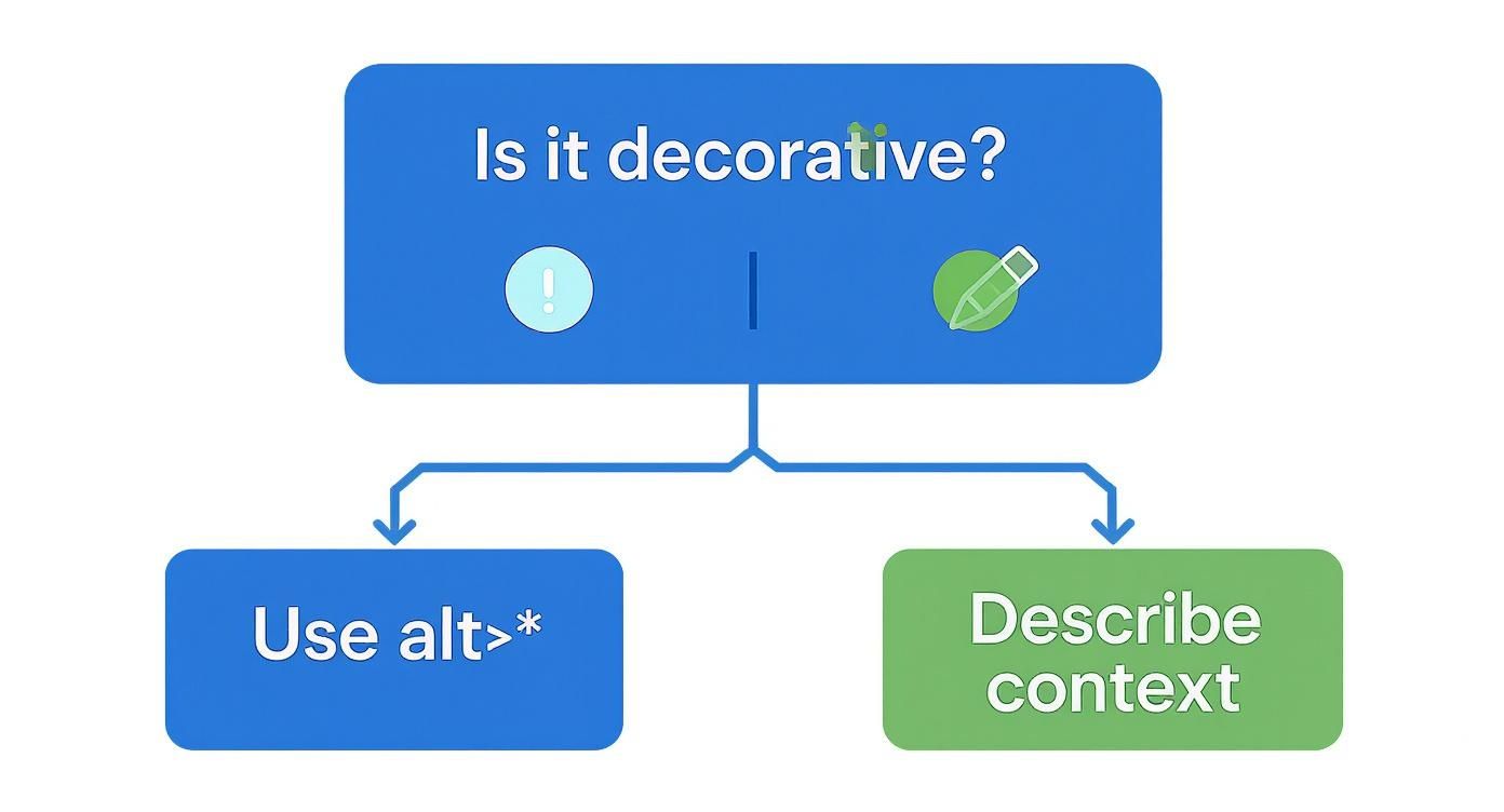
As you can see, there are really only two paths: either the image adds meaningful context and needs a description, or it's purely decorative and should be skipped by screen readers.
Linked Images and Icons
When an image is also a link, the alt text’s job changes. It needs to function like anchor text, describing the destination of the link. This is a critical usability and accessibility rule.
Imagine your company logo in the website header links to the homepage. The alt text shouldn't be "Company Logo." It should be "Site Igniters homepage." For a social media icon, like a stylized bird, the alt text shouldn't be "blue bird," but rather "Follow us on X." The purpose is navigation, so the alt text has to reflect that action.
Handling Decorative Images Correctly
So, what about all those images that are just there for looks? This includes things like background patterns, abstract shapes, or stylistic dividers that add no real information. For these, you should use a null alt attribute.
In the HTML, this looks like alt="".
It's really important to understand that a null alt attribute is completely different from a missing one.
alt="": This is your way of telling screen readers, "This image is decorative, you can safely ignore it." The screen reader will skip right over it, creating a much cleaner, less cluttered experience for the user.- Missing
altattribute: If you leave the attribute off entirely, the screen reader gets confused. It will often try to guess what's there by reading the image's filename out loud. This leads to a clunky and distracting experience, like hearing "blue-swoosh-divider-final.png."
Using alt="" is a deliberate choice that shows you've considered an image's purpose. It’s an essential tool for creating a seamless experience for people using assistive technology.
Common Alt Text Mistakes to Avoid
Even when you have the best intentions, it's surprisingly easy to fall into a few common traps that make your alt text unhelpful or, even worse, annoying for users. Getting this stuff right is a big deal. Small mistakes can put up huge barriers for people with disabilities and torpedo your SEO at the same time.
Learning to spot these common issues is the first step toward writing great alt text every time.
One of the biggest and most frequent problems is simply missing alt text. This happens when the alt attribute is just left out completely. When that happens, screen readers are forced to guess what the image is, or they'll just read out a long, nonsensical image filename.
This immediately shatters the user experience, leaving a confusing blank spot where valuable information should be.
And this isn't a small problem. The recent WebAIM Million 2025 accessibility report analyzed 58.6 million images and found that a shocking 18.5% were missing alt text. You can dig into the full findings yourself on the official WebAIM project page.
Using Filenames as Default Alt Text
A close cousin to missing alt text is letting your Content Management System (CMS) use the image filename as the description. A lot of platforms, especially older versions of WordPress, will do this automatically if you don't step in and write something yourself.
You end up with useless junk like alt="IMG_5034.jpg" or alt="blue-button-final-v2.png". This gives the user zero value and tells search engines that you haven't bothered to explain the image's context.
Here's how to fix it:
- Always check the alt text field: Make it a habit. As soon as you upload an image, fill in the alternative text field with a real description.
- Audit your existing content: Use a website crawler or a browser extension to hunt down images where the alt text is just the filename. Start by fixing these on your most important pages.
This simple habit can drastically improve the accessibility and SEO value of your entire image library.
Writing Redundant or Repetitive Descriptions
Another classic blunder is writing alt text that just repeats what's already in a caption or the surrounding text. This is incredibly frustrating for screen reader users, who are forced to listen to the exact same information twice.
For instance, if your caption says, "CEO Jane Smith speaks at the 2024 Tech Summit," your alt text should not be "CEO Jane Smith speaking at the 2024 Tech Summit."
Your alt text should complement the surrounding text, not just echo it. Think of it as a chance to add a layer of detail that's only available visually. A much better alt text here would be: "Jane Smith on stage, gesturing toward a large screen displaying company growth charts."
This mistake is especially common in product galleries where you have multiple photos of the same item from different angles.
- Bad Practice: Using "Red running shoe" for all five images.
- Good Practice: Describing what makes each shot unique.
alt="Red Nike running shoe, side view showing the white swoosh logo."alt="Top-down view of the red running shoe, highlighting the mesh toe box."alt="Close-up of the textured sole of the red running shoe."
This approach gives users a much richer and more detailed picture, and it gives search engines more specific keywords to index. Sidestepping these common errors ensures your alt text actually does its job: adding value and creating a better experience for everyone.
Tools and Workflows for Managing Alt Text
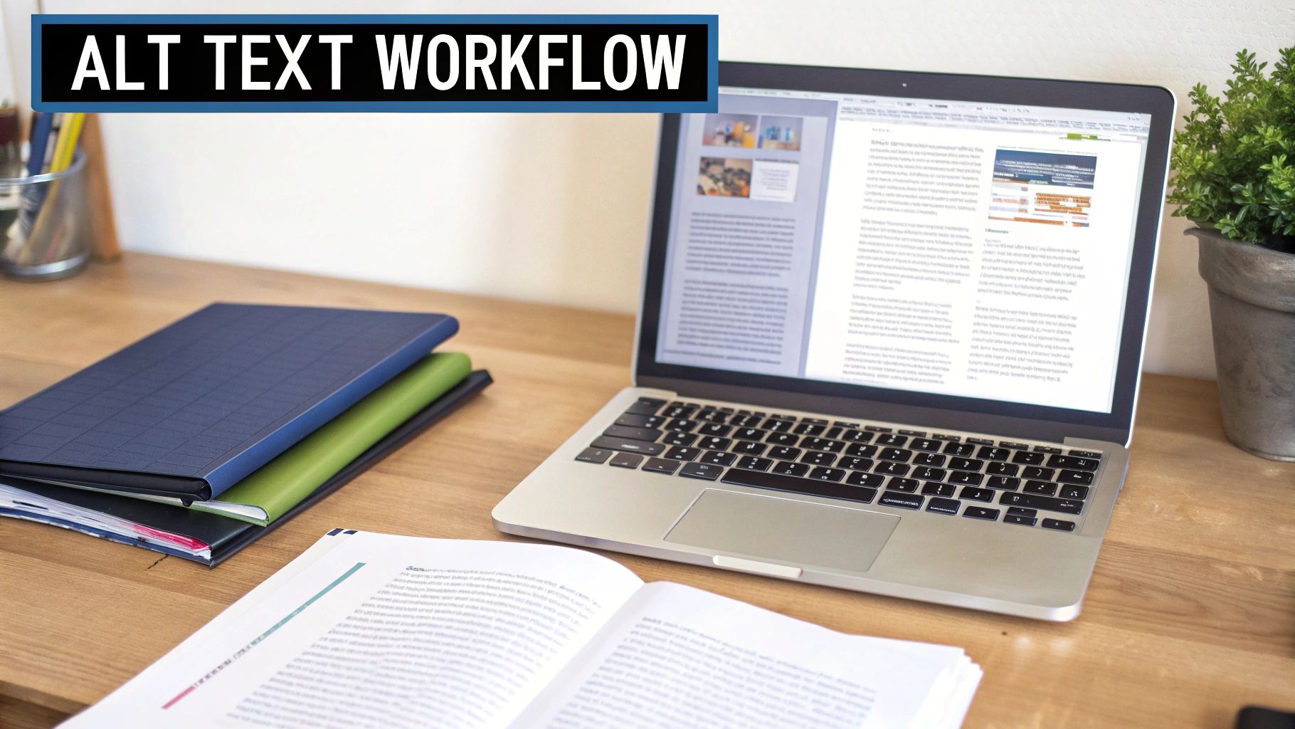
If you're using WordPress, the screenshot above probably looks familiar. It shows exactly where your alt text goes—a simple field that's all too easy to skip, but absolutely critical for accessibility and SEO.
Writing alt text for a few images here and there is no big deal. But what happens when you’re dealing with hundreds, or even thousands, of images across your site? Without a solid system, things get messy fast. Consistency goes out the window, and images inevitably fall through the cracks. This is where you need the right tools and a clear workflow to keep everything on track.
Thankfully, most modern Content Management Systems (CMS) like WordPress, Shopify, or Webflow build this right into the media upload process. The real trick is making it a non-negotiable step. Every. Single. Time.
For larger organizations juggling massive media libraries, dedicated tools are a game-changer. Teams handling a huge volume of visuals can benefit from specialized Marketing Asset Management software to manage the entire content lifecycle, including how alt text is created and stored.
Can AI Help With Alt Text?
AI has burst onto the scene with tools that can generate alt text automatically. These models can "see" an image and spit out a surprisingly accurate description in seconds. It’s a massive time-saver, especially if you have a huge backlog of images with no descriptions.
But it’s not a perfect fix. AI is great at identifying objects and basic actions, but it almost always misses the context and intent behind an image. An AI might see a photo and describe it as, "Man looking at laptop." What it doesn't know is that the image is meant to show the frustration of dealing with a software bug—a crucial detail a human would catch instantly.
So, here’s a more balanced way to approach it:
- For speed: Use an AI tool to generate a first draft for your entire image library. This is a fantastic way to quickly fill in the blanks and get a baseline.
- For quality: Always—and I mean always—have a human review and edit the AI-generated text. Their job is to add that missing context, tweak the language, and make sure it actually fits the content around it.
Think of AI as an assistant, not a replacement. Let it do the heavy lifting, but use your human brain to add the nuance and purpose that makes alt text truly useful.
This hybrid approach lets you handle a large volume of images without sacrificing the quality that both your users and search engines are looking for.
Creating a Team Workflow That Actually Works
When you have multiple people creating content, you absolutely need a documented workflow. A chaotic, "do-it-when-you-remember" approach leads to a mess of different alt text styles or, worse, none at all. A clear process puts everyone on the same page.
Your workflow doesn't need to be complicated. A simple style guide that outlines your approach is a perfect starting point. If you’re looking for a great guide on managing a platform like WordPress, you can explore the valuable tips in The Missing WordPress Manual eBook.
This guide can be as simple as a one-page checklist that covers the essentials.
Key Things to Include in Your Alt Text Style Guide:
- Define Your Voice: Are your descriptions purely functional or a bit more conversational to match your brand? Settle on a consistent tone.
- Set a Character Guideline: Remind everyone of the goal to stay under 125 characters. Keep it punchy.
- Show, Don't Just Tell: Provide clear examples of good vs. bad alt text for different image types, like product photos, team headshots, and charts.
- Outline the Process: Make it crystal clear when and where alt text must be added (e.g., "Alt text must be added in the CMS for every image upon upload.").
Finally, make regular audits part of your routine. Once a quarter, use a website crawler or an accessibility checker to hunt down images with missing alt text or those still using a default filename. This proactive check helps you fix errors before they pile up, keeping your site accessible and optimized.
Your Alt Text Questions Answered
Even when you feel like you have a handle on the basics, writing alt text in the real world always brings up a few tricky questions. I've been there. This section is my attempt to give you quick, straight-to-the-point answers for the most common hang-ups I see.
How Long Should Alt Text Be?
Keep it concise. That’s the golden rule. While there's no hard limit coded into the internet, the long-standing best practice is to aim for under 125 characters.
Why that number? It’s not random. Most screen readers just stop reading somewhere around the 125-character mark. If you go over, your carefully crafted description could get cut off mid-sentence. Sticking to this limit also has a great side effect: it forces you to be focused and clear, which is always a good thing.
Should I Include My Brand Name in Alt Text?
Almost always, the answer is no. The one major exception is when your brand is a core part of the image itself. The whole point of alt text is to describe what’s in the picture, not to sneak in extra branding.
Just think about it from the user's perspective. If someone using a screen reader is already on your website, they don't need to hear your company name tacked onto the end of every image description. It's just noise.
The big exception here is your logo, especially when it’s the link back to your homepage. In that specific case, the alt text should describe where the link goes, like "Site Igniters homepage." It's functional, not just descriptive.
What Is the Difference Between Alt Text and an Image Caption?
This one trips people up all the time, but the distinction is actually pretty simple once you get it. They have completely different jobs.
- Alt Text: This is for users who can't see the image. It’s read aloud by screen readers and crawled by search engines, but it's totally invisible to most visitors. Its purpose is purely accessibility and SEO.
- Image Caption: This is for all users. It's the text you see on the page, usually right below the image. Its job is to add extra context, give credit, or make a comment that everyone can appreciate.
An image might need one, the other, or both. The key is that they should work together, not just repeat each other. If your caption already explains what’s happening in a photo, the alt text can focus on the specific visual details the caption leaves out.
Do I Need Alt Text for My Company Logo?
Yes, you absolutely do. Any image that isn't purely decorative needs alt text, and your logo is one of the most important informational images on your site. It identifies your brand and is often a key piece of navigation.
How you write it just depends on what the logo is doing:
- If the logo links to your homepage: The alt text needs to describe the action. Something like
alt="Site Igniters homepage"is perfect. - If the logo is just an image (like on a sponsors page): The alt text should simply identify what it is. For example:
alt="Site Igniters logo".
Never, ever leave a logo’s alt text blank. It’s a huge part of your site’s identity, and making it accessible is non-negotiable.
At Site Igniters, we build websites that don't just look great—they're fully accessible and primed for search engine success. If you need a hand making your site work for every single user, reach out to our team today.
Seth Sanders is the founder of Site Igniters, a digital marketing agency in El Dorado Hills, California.