
How to reduce website bounce rate: 4 quick tactics

Before you can lower your website's bounce rate, you first have to figure out why visitors are bouncing in the first place. More often than not, it comes down to a simple mismatch: what they expected to find versus what your page actually delivered. It could be slow load times, content that misses the mark, or just a confusing layout. Tackling these core issues is always the best way to convince people to stick around.
- High bounce rates usually signal a mismatch between visitor expectations and your page content or experience.
- Faster load times and a strong visual first impression are the quickest ways to reduce bounces.
- Mobile optimization and clear next-step CTAs guide visitors deeper into your site.
What a High Bounce Rate Is Really Telling You
A high bounce rate feels like a problem, but it’s really just a symptom. Think of it as a piece of data telling a story about your visitor's first impression. Before you start tweaking buttons and changing colors, you have to play detective and figure out what that story is. The number itself is almost meaningless without context.
For instance, a 75% bounce rate on a blog post might be totally fine. Someone Googles a question, lands on your article, gets their answer, and leaves happy. Mission accomplished. On the other hand, a 45% bounce rate on your checkout page is a five-alarm fire. It means nearly half of your paying customers are getting spooked at the very last step.
This is why understanding each page's goal is so important. The real objective isn't to chase some arbitrary "low" number, but to make sure the bounce rate makes sense for what that page is supposed to do.
Diagnosing the Problem in Google Analytics 4
Google Analytics 4 (GA4) has made a big shift, moving the focus from the old-school bounce rate to a much more useful metric called "engagement rate." In GA4, a bounce is simply the opposite of an engaged session.
So, what counts as an "engaged" session? A visitor has to do one of these three things:
- Stay on your site for more than 10 seconds.
- Trigger a conversion event (like filling out a form).
- Look at least two pages.
If a session doesn't meet any of that criteria, GA4 calls it a bounce. This is a smarter way to measure things. It helps separate the people who leave instantly from those who actually read your content, even if they don't click anywhere else. Your first move should be to jump into your GA4 reports and find which pages are the biggest offenders.
This handy flowchart breaks down how you should think about your bounce rate diagnosis.
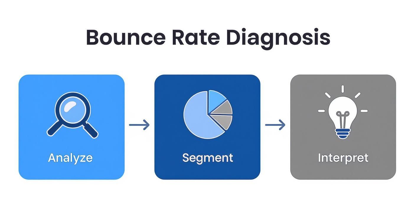
As you can see, a real diagnosis is about more than just looking at a number. You have to analyze the data, segment it to get the full picture, and then figure out the why behind what your users are doing.
Setting Realistic Benchmarks
So, what’s a "normal" bounce rate, anyway? The truth is, it's all over the place depending on your industry and the type of website you have.
This table gives you a quick gut check to see how your site's bounce rate compares to industry averages. This context is key to setting realistic goals.
Bounce Rate Benchmarks by Website Type
| Website Type | Typical Bounce Rate Range | What It Means |
|---|---|---|
| E-commerce & Retail | 20% – 45% | Visitors are expected to browse multiple products, so a lower bounce rate is ideal. |
| B2B & SaaS | 25% – 55% | Users are often researching solutions, so they might visit a few key pages before deciding. |
| Lead Generation | 30% – 55% | The goal is a specific action (form fill), so a high bounce rate can signal a weak offer. |
| Content & News Sites | 40% – 60% | People often come to read one article and leave. Higher rates are common but can be improved. |
| Blogs | 65% – 90% | A very high bounce rate can be normal if the visitor got the info they needed from a single post. |
| Landing Pages | 60% – 90% | Since there's only one main call-to-action, a high bounce rate means the offer isn't compelling. |
While e-commerce sites often see bounce rates between 20% and 45%, it's not unusual for blogs to have rates anywhere from 65% to 90%. Knowing where you stand helps you set goals that actually make sense for your business.
A healthy bounce rate is generally considered to be between 26% and 40%, but context is everything. A high rate isn't always a sign of failure if the user's intent was met on a single page.
By digging into your analytics and filtering for pages that get a lot of traffic but have low engagement, you can quickly build a priority list. This data-first approach makes sure you’re putting your energy where it will count the most. Ultimately, improving these user experience metrics is a huge part of any solid search engine optimization (SEO) strategy, because it tells Google that your site is valuable and gives people what they're looking for.
Make Your Website Faster to Keep Visitors On-Site

Let's be honest, patience is a virtue few of us have online. A sluggish website is one of the quickest ways to send a potential customer packing before your content even gets a chance to impress them. In this game, every single second counts.
The link between speed and visitor retention is undeniable. When a page's load time jumps from just one second to ten seconds, the odds of a user bouncing skyrocket by a massive 123%. What’s more, nearly half of all users will just give up and leave a site if it doesn’t load within four seconds. This makes speed a non-negotiable part of your strategy to lower your bounce rate.
This isn't just some minor technical glitch; it's a direct hit to your business goals. A slow site creates friction from the very first click, signaling a poor user experience from the get-go.
Running Your First Speed Audit
Before you can fix the problem, you need to know exactly what you're up against. Guessing just won't cut it. Your first move should be running a comprehensive speed audit to get a clear baseline of how your site is performing right now.
Tools like Google PageSpeed Insights are perfect for this. They give you a detailed report on how your site performs on both mobile and desktop, grading you on key metrics called Core Web Vitals. These measure loading performance, interactivity, and visual stability—basically, how fast the page feels to a real person.
Don't just glance at the overall score and call it a day. The real gold is in the "Opportunities" and "Diagnostics" sections. This is where the tool hands you a prioritized to-do list, pointing out exactly what’s dragging your site down, from massive images to inefficient code. To get into the nitty-gritty of the technical side, you can explore this guide on how to improve site speed with effective fixes.
High-Impact Fixes for Faster Load Times
Once you have your audit results, it’s time to roll up your sleeves. While there are dozens of things you could do, focusing on a few key areas will give you the biggest bang for your buck. Think of these as the low-hanging fruit of speed optimization.
Here are three critical areas to tackle first:
- Compress Your Images: Large, unoptimized images are the number one culprit behind slow-loading pages. Use tools like TinyPNG or image compression plugins to shrink file sizes way down without making your photos look grainy. This one change can often shave seconds off your load time.
- Enable Browser Caching: Caching tells a visitor's browser to save static parts of your website (like your logo and other core files). When they come back, their browser doesn't have to reload everything from scratch, which makes return visits feel almost instant.
- Minify Your Code: Your website's HTML, CSS, and JavaScript files often contain extra characters, like spaces and comments, that developers use but browsers don't need. Minification is a process that automatically removes all that fluff, making the files smaller and faster to process.
Nailing these three fixes is a fantastic starting point. They address the most common speed bumps and can deliver a noticeable improvement in user experience right away.
Key Takeaway: Shaving even one or two seconds off your load time can have a direct, positive impact on your bounce rate. A faster website isn't just a technical win; it shows you respect your visitor's time, and that encourages them to stick around.
Beyond the Basics: Your Hosting and CDN
If you've handled the basics and your site is still lagging, it might be time to look at your foundation. Your website's hosting plan and whether you're using a Content Delivery Network (CDN) play a massive role in performance.
Cheap, shared hosting plans are often slow because you're fighting for server resources with hundreds of other websites. If your business gets a decent amount of traffic, upgrading to a better plan can provide a major speed boost. Your server's location matters, too. If your server is in Dallas but most of your visitors are in London, that data has a long way to travel.
This is where a Content Delivery Network (CDN) comes in. A CDN is a network of servers spread all over the world that stores copies of your site's assets. When someone visits your site, the CDN delivers the content from the server closest to them, dramatically cutting down latency and improving load times for everyone, no matter where they are.
Create a First Impression That Makes People Stay
While a fast website gets visitors in the door, it’s the immediate experience that convinces them to take their coats off and stay a while. If your content doesn’t instantly connect with what they’re looking for, all that speed optimization is wasted.
Those first few seconds are your only chance to prove your page is worth their time.
This critical window is all about nailing search intent. Simply put, does your page deliver exactly what the user expected when they clicked your link? A mismatch here is one of the biggest reasons people bounce. If someone searches for "easy payroll tools" and lands on a complex enterprise HR platform, they’re gone in a flash.
Crafting the Perfect Above-the-Fold Experience
Everything a visitor sees without scrolling is "above the fold." Think of it as your digital storefront window—it needs to be compelling. Your headline, introduction, and initial visuals have to work together to answer one crucial question for the visitor: "Am I in the right place?"
A powerful above-the-fold experience should do three things right away:
- Confirm Relevance: The main headline has to align perfectly with the search term that brought them there. It’s a signpost.
- Communicate Value: A sharp subheading or intro sentence should immediately explain the benefit of staying. What problem will you solve for them?
- Encourage Engagement: A clean layout, an interesting visual, or a clear next step should pull the user down the page.
Pro Tip: Read the first two sentences of your page out loud. Do they sound like a direct answer to a question someone would type into Google? If not, rewrite them until they do. This simple test helps you cut the fluff and get straight to the point.
Designing for How People Actually Read Online
Here’s the thing: people don't read websites; they scan them. They hunt for keywords, headings, and visual cues that signal the information they need. A giant wall of text is an immediate turn-off and a surefire way to send your bounce rate through the roof.
You have to structure your content for this scanning behavior.
- Extremely Short Paragraphs: Keep paragraphs to one to three sentences, max. This creates white space and makes the text feel less intimidating.
- Clear, Action-Oriented Headings: Use H2 and H3 subheadings to break up topics. They act as a table of contents, letting scanners jump to the sections they care about.
- Strategic Bolding: Use bold text to highlight key terms, stats, or takeaways. This helps draw the eye to the most important info on the page.
Think of your page not as a novel, but as a well-organized reference guide. The easier you make it for someone to find their specific answer, the more valuable they'll see your site.
Using Visuals and Layout to Create a Welcoming Space
The look and feel of your page play a huge part in that first impression. A cluttered, dated, or confusing design creates friction and can cause visitors to leave before they even read a single word. Your goal is to create a clean, inviting environment.
Consider how these elements impact the user experience:
- White Space: Don't cram every inch of the page with text and images. Generous white space gives your content room to breathe and helps guide the user's eye.
- Clean Typography: Choose a font that is easy to read. Make sure the font size is large enough (especially for mobile) and that there is good contrast between the text and the background.
- Engaging Media: Visuals can communicate information way faster than text. An intro video, for example, can grab attention and explain a complex topic in under a minute. As you plan your content, exploring the powerful benefits of video marketing can open up new ways to hook users from the moment they land.
Beyond just speed and content, other tools can really enhance these first few seconds. It's worth learning how chatbots improve customer experience by providing instant answers, which can be another great way to keep people from bouncing. When you combine strong content with thoughtful design, you create an experience that doesn't just answer a question—it makes people feel welcome.
Design for Mobile Users and Guide Their Next Step

If your website feels clumsy on a smartphone, you're practically shoving a huge chunk of your visitors out the door. A slow, awkward mobile experience is one of the fastest ways to send your bounce rate through the roof.
These days, designing for mobile isn't just about making your site shrink to fit a smaller screen. It's about building an entirely different experience—one designed for thumbs and touchscreens.
You have to go way beyond basic responsive design. Think about how someone actually holds their phone. Are your buttons big enough for a thumb to hit without aiming? Is your navigation simple, or are you forcing people to make frustratingly precise taps on tiny links? Forms should feel effortless, not like a chore that makes someone give up and leave.
But even a flawless mobile site is useless if visitors don't know what you want them to do. This is where a clear, compelling Call to Action (CTA) makes all the difference.
Building a Truly Mobile-First Experience
A mobile-first approach forces you to design for the smallest screen first and then expand for larger ones. This discipline is a blessing in disguise because it makes you prioritize what truly matters, cutting out the clutter that so often bogs down desktop sites.
Your mobile visitors are usually on the go and need answers now.
Here’s what a great mobile experience really looks like:
- Thumb-Friendly Design: Key buttons and navigation elements should be placed where thumbs can easily reach them—usually in the middle or bottom of the screen.
- Legible Text: Use a clean font that's easy to read without any pinching and zooming. Just as important is high contrast between your text and the background.
- Simplified Navigation: A clean "hamburger" menu or a simple navigation bar at the bottom works wonders. Avoid complex, multi-level dropdowns that are a nightmare on a touchscreen.
- Optimized Forms: Keep forms as short as humanly possible. Use larger input fields and smart defaults, like pulling up a numeric keypad for phone numbers.
Key Takeaway: A seamless mobile experience is a sign of respect for your user's time. When a site just works on their phone, it builds instant trust and makes them far more likely to stick around.
And as user behavior evolves, so should your strategy. With people increasingly using voice commands, you should also look into how to optimize your website for voice search to stay ahead of the curve.
Crafting Calls to Action That Actually Convert
Your CTA is the critical link between a visitor's interest and a business goal. Whether you want them to "Buy Now," "Sign Up," or "Learn More," the CTA needs to feel like a natural next step, not a pushy sales pitch.
A powerful CTA is a blend of smart design and persuasive language. It has to stand out visually without being obnoxious.
CTA Effectiveness Checklist
Run your key landing page CTAs through this checklist. It's a simple way to spot weaknesses and find opportunities for improvement.
| CTA Element | Best Practice | Yes/No |
|---|---|---|
| Visibility | Does the button's color contrast sharply with the background? | |
| Placement | Is the CTA placed logically where a user would expect to find it? | |
| Clarity | Is the button text clear, concise, and action-oriented (e.g., "Get Your Quote")? | |
| Size | Is the button large enough to be easily tapped on a mobile screen? | |
| Value | Does the copy communicate the benefit of clicking the button? |
For example, a vague CTA like "Submit" is far less motivating than something like "Download My Free Guide." The second one tells the user exactly what they're getting, making the click a much easier decision.
The button’s design, placement, and wording all need to work together to guide the user’s journey. By giving them a clear path forward, you reduce confusion and eliminate a major reason they might bounce.
Don't let a confusing website layout chase potential customers away. If someone lands on your site and can't figure out where to go next, they'll just leave. That frustration is a killer for your business goals. A global analysis actually found a direct link between rising bounce rates and a 6.1% decrease in conversions. It's a clear sign that a clunky user journey hits you right in the wallet. You can dig deeper into how user experience impacts sales by checking out these web traffic insights.

Simplify Your Main Navigation
Think of your main navigation menu as the roadmap for your visitors. If it’s cluttered with jargon or just plain confusing, it’s like handing them a map with half the street names missing. The whole point is to make it so dead simple that a brand-new visitor knows exactly where to find what they need, instantly.
You have to get out of your own head and think from the user's perspective, not your company’s internal org chart. Someone looking for prices doesn't want to play a guessing game between "Solutions," "Products," and "Services." They just want a link that says "Pricing." It's that simple.
A few tips for a cleaner menu:
- Limit your top-level items: Aim for five to seven main categories. Any more than that and people get overwhelmed and just give up.
- Use plain English: Ditch the corporate-speak. "Contact Us" works every single time. "Get in Touch" might sound friendly, but clarity is king.
- Make sure it works on mobile: On a phone, your navigation needs to collapse neatly into a "hamburger" menu that's easy to see, tap, and scroll through.
Use Internal Links to Create a Web of Content
Internal linking is probably one of the most powerful—and most overlooked—tools for guiding users and slashing your bounce rate. This isn't just about SEO; it’s about creating a smooth, logical path from one piece of content to the next. When someone finishes reading one of your blog posts, they shouldn't hit a dead end.
It's your job to be their guide, pointing them to the next logical step.
For instance, if you write a blog post on "The Benefits of Drip Irrigation," you should absolutely be linking to pages like "How to Install a Drip System" or your product page for "Drip Irrigation Kits" right within the article text. This simple strategy does two huge things for you:
- It keeps people on your site longer, clicking around and exploring more pages.
- It shows them the full range of your expertise and what you have to offer.
Key Takeaway: Every single page on your website should point somewhere else. Whether it's a link to a related article, a call to action button, or a breadcrumb trail, never leave your visitors hanging and wondering what to do next.
Make Your Search Bar Actually Useful
For any website with more than a handful of pages, a good search bar is non-negotiable. A lot of users, especially those who know what they're looking for, will go straight for that search box instead of clicking through your menus. A bad search experience—one that gives them junk results or, even worse, nothing at all—is an instant bounce.
Your site's search function has to be fast, accurate, and forgiving of typos. It should also understand synonyms and offer suggestions as someone types. Think of it as your website's personal concierge. Investing in a solid search tool like SearchWP can be a game-changer, turning a potential bounce into a quick conversion.
Answering Your Top Questions About Bounce Rate
Even after you've got a solid plan, a few common questions always seem to surface. This is the part where we clear up any of those lingering doubts so you can move forward and start making real progress on your website's bounce rate.
Is a High Bounce Rate Always Bad?
Not at all. In fact, this is probably the single biggest misunderstanding about bounce rate. Context is everything.
A high bounce rate can definitely be a red flag, but sometimes it means your page did its job perfectly. Think about it—some pages are built for a quick, single interaction.
Here are a few classic examples where a high bounce rate is totally fine:
- Contact Pages: Someone lands on your "Contact Us" page, grabs your phone number, and leaves. Mission accomplished. They found what they needed in seconds. That's a win.
- Specific Blog Posts: A user Googles a very specific question, your article gives them the answer right at the top, and they click away happy. You just became a trusted resource for them.
- Confirmation Pages: They just signed up for your newsletter or bought a product. The "Thank You" page confirms the action. There's nothing else for them to do, so they leave.
The real question to ask is, "What's the goal of this page?" If it's a gateway page, like your homepage, a high bounce rate is a problem. If it's a final destination, like a contact page, it might just be a sign of success.
What’s a Good Bounce Rate to Aim For?
Honestly, there’s no magic number that fits every single website. Trying to hit some arbitrary figure like 20% is usually a recipe for frustration. A much better approach is to use industry benchmarks as a starting point for your own goals.
As a general rule of thumb:
- E-commerce Sites: 20% – 45% is generally seen as a strong range. You want people to stick around and browse different products.
- Lead Generation Sites: A healthy range is around 30% – 55%. You need visitors to explore enough to trust you with their information.
- Blogs and Content Sites: Don't panic if you see numbers from 65% – 90%. This is often normal, especially for pages that provide quick, definitive answers.
Instead of obsessing over a universal average, focus on creating a consistent downward trend for your most important pages. Improvement over time is the metric that really matters.
Bounce Rate vs. Engagement Rate in GA4
With the shift to Google Analytics 4 (GA4), the conversation has moved from bounce rate to engagement rate. It's a much more insightful way to look at how people interact with your site. The two are direct opposites.
- Bounce Rate: The percentage of sessions that were not engaged.
- Engagement Rate: The percentage of sessions that were engaged.
So, what counts as an "engaged" session in GA4? One of these three things has to happen:
- The visitor stays on your site for more than 10 seconds.
- They view two or more pages.
- They complete a conversion event (like filling out a form).
This is a huge improvement. It correctly recognizes that someone who spends 45 seconds carefully reading your blog post is an engaged visitor, even if they don't click on another page. Older analytics tools would have incorrectly flagged that as a bounce.
Which Fixes Should I Prioritize First?
Staring at a long list of potential fixes can feel overwhelming. The key is to start with the low-hanging fruit—the changes that offer the biggest impact for the least amount of effort.
Your priority list should look something like this:
- Page Speed: This is your number one. A slow website frustrates everyone and is a top reason for bounces. Start with simple fixes like compressing your images.
- Above-the-Fold Content: Go to your highest-traffic pages. Does the headline and first paragraph immediately tell visitors they're in the right place? If not, fix it.
- Mobile Experience: Pull up your top five pages on your own smartphone. Is the text easy to read? Can you tap the buttons without zooming in? Address any glaring issues right away.
By tackling these foundational problems first, you improve the experience for every single visitor, which will naturally begin to bring your bounce rate down across the board.
Fixing a high bounce rate comes down to one thing: creating a better, more intuitive experience for your visitors. It takes a clear-eyed look at your data and a real commitment to understanding what your audience needs. If you're ready to turn those bounces into customers but feel stuck, Site Igniters is here to help. Our team digs into web design, SEO, and user experience to build websites that don't just attract people—they make them want to stay. Let's talk about building a website that truly performs.
Seth Sanders is the founder of Site Igniters, a digital marketing agency in El Dorado Hills, California.