
how to improve website conversion rate – A practical guide


Getting your website's conversion rate to tick upward is all about understanding your users and systematically knocking down the barriers they face on their journey. The fastest way to get started is by zeroing in on three core areas: technical performance (like how fast your site loads), user experience design, and data-driven testing.
- Improving your website conversion rate starts with understanding user behavior and removing friction from their journey.
- Compelling copy, clear calls to action, and fast page load times are the biggest conversion levers.
- A systematic A/B testing strategy ensures every change is data-driven and measurable.
Building Your Foundation for Higher Conversions
Before you jump into specific tactics, it's crucial to adopt the right mindset for successful conversion rate optimization (CRO). Don't think of it as a one-and-done checklist. It's really a continuous cycle of learning, testing, and improving.
Your website isn't just a digital brochure; it's an active tool designed to steer visitors toward a specific goal. That could be anything from making a purchase to filling out a form or signing up for your newsletter. Every single element on your site either helps or hurts that journey.
The real goal here is to hunt down those friction points—the moments where users get confused, frustrated, or distracted—and smooth them out. This takes a holistic view that connects every part of your digital presence.
The Three Pillars of CRO Success
Effective CRO really comes down to three foundational pillars. They all work together, and if you neglect one, your efforts in the others will probably fall flat.
- Technical Performance: This is the bedrock. If your site is slow, glitchy, or a mess on mobile, even the most brilliant copy and design won't save it. People expect a fast, smooth experience, period.
- User Experience (UX) and Design: This is all about how intuitive and easy your site is to get around. It's about creating a crystal-clear path to conversion with logical layouts, easy-to-read text, and calls to action that are impossible to miss.
- Data-Driven Testing and Analysis: This is how you stop guessing and start knowing what actually works. By digging into user behavior and running controlled experiments like A/B tests, you can make smart decisions based on real data, not just a hunch.
One of the biggest technical factors is, without a doubt, site speed. Think about this: a website that loads in just one second can see a conversion rate 2.5 times higher than a site that takes five seconds. Why? Because users, especially on mobile, have zero patience for a slow page and will bail almost instantly.
Investing in performance tweaks like compressing images and minimizing code gives you a direct and measurable boost.
To give you a clearer picture, I've broken down these core areas into a simple table. Think of this as your starting map for where to focus your energy for both quick wins and long-term gains.
Key Pillars of Conversion Rate Optimization
| Pillar | Primary Goal | Example Tactic |
|---|---|---|
| Technical Performance | Ensure the site is fast, stable, and accessible on all devices. | Optimize image sizes and leverage browser caching to cut down load times. |
| User Experience (UX) | Make the user's journey intuitive, clear, and free of obstacles. | Simplify navigation menus and ensure call-to-action buttons are prominent. |
| Data & Testing | Base decisions on real user behavior, not assumptions. | Run an A/B test on your product page headline to see which one drives more clicks. |
Focusing on these three areas is the most reliable way to build a website that not only works but converts.
At its heart, CRO is all about empathy. When you put yourself in your users' shoes to understand their goals and pain points, you can build an experience that not only solves their problems but also hits your business objectives.
Ultimately, a strong foundation in these areas ensures your website isn't just pulling in visitors from your https://siteigniters.com/search-engine-optimization-seo/ efforts—it's actually ready to turn them into customers. For a deeper dive, check out these proven strategies to improve website conversion rates. This approach will transform your site from a passive digital asset into your hardest-working sales tool.
Mastering User Experience and Intuitive Site Design

This screenshot from the Nielsen Norman Group, a big name in user experience research, is a perfect example of clear design in action. The layout guides your eye with plenty of whitespace and clean content blocks. It doesn't feel overwhelming; it just works.
Truly great user experience (UX) is almost invisible. It’s that feeling a visitor gets when they glide through your site, find exactly what they need, and take action without a single moment of confusion. This seamless journey is the secret sauce for a higher website conversion rate.
Think about your website like a physical store. If the aisles are a mess, the signs are gibberish, and the checkout line is endless, people are going to walk out. Your website isn't any different. Friction is the ultimate conversion killer.
Declutter and Simplify Your Navigation
One of the fastest ways to send a visitor packing is a chaotic navigation menu. If people can't figure out where to go in a few seconds, they're not going to stick around and try to decode your sitemap. The goal is to slash the number of clicks it takes to land on your most important pages.
Take a hard, honest look at your main navigation. Is it crammed with a dozen different options? Could some of them be grouped under a single, more intuitive category?
- Limit Your Top-Level Items: Try to stick to five to seven main navigation items. This helps visitors avoid decision fatigue and find their path quickly.
- Use Clear Language: Ditch the clever industry jargon. Use simple, direct terms everyone understands, like "Services," "About Us," and "Contact."
- Make Sure It Works on Mobile: Your navigation has to be a breeze to use on a smartphone. A "hamburger" menu needs to be easy to tap, and the links inside must have enough space to prevent fat-finger mistakes.
When you streamline your navigation, you create a clear, obvious path for users, gently guiding them exactly where you want them to go.
The Power of Visual Hierarchy and Whitespace
Visual hierarchy is just a fancy way of saying you’re telling a user’s eyes where to look first, second, and third. It’s all about using size, color, and placement to make the most important stuff—like your headline and call-to-action (CTA) button—pop.
Then there's whitespace, or negative space. It’s the empty area around your text and images. This isn’t wasted real estate; it's a powerful design tool that boosts readability and cuts down on mental clutter. A crowded page is stressful, but a page with plenty of whitespace feels calm, focused, and professional.
A well-designed page doesn't just look pretty—it actively guides the user. Smart use of visual hierarchy and whitespace makes your value proposition stand out and your CTAs impossible to ignore, which is how you improve your website conversion rate.
This isn’t just about looking good, either. It’s about making sure your site is accessible to everyone. Strong design principles are a huge part of digital accessibility. If you want to create an inclusive experience and avoid legal headaches, understanding these guidelines is a must. You can dive deeper into the basics of ADA website compliance and see how it overlaps with great UX.
Optimize Your Forms to Reduce Abandonment
Forms are often the last barrier between you and a conversion. A clunky, demanding form is a top reason for abandonment, especially during checkout or on a lead gen page. Remember, every single field you add creates more friction.
Your job is to make this process as painless as humanly possible.
- Only Ask for What You Absolutely Need: Does your sales team really need a fax number on that first contact form? Probably not. Cut every single field that isn't essential.
- Use Crystal-Clear Error Messages: When someone messes up, tell them exactly what went wrong and where. A vague "Invalid Input" message is infuriating. Be specific.
- Show the Finish Line: For multi-step forms, a simple progress bar works wonders. It shows users how close they are to being done, which can be just the motivation they need to complete the process.
By optimizing your forms, you remove that final point of resistance, making it dead simple for motivated visitors to become your next customers.
Writing Compelling Copy and Calls to Action

While a clean design can guide a visitor's eye, it’s the words on your website that truly persuade their mind. Think about it: every headline, product description, and button is a mini-sales pitch. Great copy doesn't just list features; it taps into a visitor's core problem and frames your solution as the only logical answer.
Your copy has to immediately answer their most urgent question: "What's in it for me?" If they can't figure that out in a few seconds, they're gone. This is where a rock-solid value proposition becomes your most powerful asset. It’s a short, punchy statement that spells out the tangible benefits someone gets by choosing you.
Crafting a Powerful Value Proposition
Don't confuse your value proposition with a slogan or tagline. It’s a clear, simple promise of the value you deliver, and it should be one of the first things a visitor sees, usually right in the hero section of your homepage.
A truly effective value proposition nails three key elements:
- Relevance: It shows exactly how your product solves a real problem or improves a customer's life.
- Quantified Value: It lays out the specific benefits in a way people can grasp (e.g., "save 10 hours a week").
- Unique Differentiation: It tells your ideal customer why they should buy from you and not the other guys.
For instance, instead of a bland "We sell accounting software," a much stronger value proposition would be: "The ridiculously easy accounting software for freelancers. Send invoices, track expenses, and get paid 2x faster without the headache." See the difference? This version is specific, highlights clear benefits, and speaks directly to a niche audience.
The Art of the Irresistible Call to Action
Your call to action (CTA) is the single most critical piece of copy on any page. It's the moment of truth where you actually ask for the conversion. Generic, lazy CTAs like "Submit" or "Click Here" are conversion killers. They don't tell the user what they get for clicking, creating friction and hesitation.
To really boost your website conversion rate, your CTAs need to be specific, action-oriented, and genuinely compelling.
Your CTA button isn't just a button; it's the end of a conversation. The copy should complete the sentence, "I want to…" For example, "I want to Start My Free Trial" or "I want to Get My Free Quote."
A great CTA often sprinkles in a sense of urgency or exclusivity.
-
Weak CTA: "Subscribe"
-
Strong CTA: "Join 10,000+ Marketers and Get Weekly Insights"
-
Weak CTA: "Download"
-
Strong CTA: "Download My Free Ebook Now"
The trick is using verbs that imply action and ownership. Words like "Get," "Reserve," "Start," and "Claim" empower the user, giving them a sense of control and immediate benefit.
Building Trust with Strategic Social Proof
Before most people click your CTA, they need to trust you. That’s where social proof comes in. It’s a basic psychological trigger: people tend to follow the actions of others, assuming those actions are the right ones.
Placing social proof strategically near your CTAs can slash hesitation and build instant credibility. Here’s how:
- Customer Testimonials: Use real quotes from happy customers that hit on specific pain points you solve. Adding a photo and a name makes them infinitely more believable.
- Case Studies: A detailed case study offers undeniable proof of your results. Link out to these from your service pages to show prospects how you’ve helped businesses just like theirs.
- Data and Numbers: Specific figures like "500+ projects delivered" or "Trusted by over 1,000 small businesses" carry a weight that vague statements just can't match.
When you combine a crystal-clear value proposition with compelling CTAs and undeniable social proof, your copy stops being just words on a page. It becomes a powerful conversion engine.
Driving Conversions with Email and Retargeting
Let's face it: not every visitor is ready to buy the moment they land on your website. That’s perfectly okay. Some of your best future customers just need a little more time and a few gentle reminders to come back. This is where a smart follow-up strategy, combining email marketing and retargeting, turns those missed opportunities into loyal customers.
These methods are all about re-engaging people who have already raised their hand and shown interest in what you offer. Instead of shouting into the void trying to attract cold traffic, you’re nurturing warm leads who are much, much closer to making a decision. This focused approach is a cornerstone of boosting your website's conversion rate.
Capitalizing on the Power of Email Marketing
Email marketing consistently punches way above its weight, delivering one of the highest returns on investment you can get from any digital channel. To put a number on it, email is projected to hit an average conversion rate of 10.3% in 2025—that absolutely towers over channels like organic search and social media. The reason is simple: you’re talking to an audience that has explicitly asked to hear from you. For more context, you can dig into these eCommerce conversion rate benchmarks on Convertcart.com.
The real magic happens when you move beyond generic, one-size-fits-all email blasts and start using automation and personalization.
- Abandoned Cart Emails: If you run an e-commerce site, this is non-negotiable. Sending a friendly reminder to someone who left items in their cart can recover a huge chunk of otherwise lost sales. A simple "Did you forget something?" email, complete with a picture of the product, works wonders.
- Welcome Series: When someone new subscribes, don't just leave them hanging. A multi-part welcome series is your chance to introduce your brand's story, show off your best products, and maybe offer a small incentive to nudge them toward that first purchase.
- Back-in-Stock Alerts: Got a popular item that sold out? Give visitors a way to get notified when it returns. These emails go out to people with sky-high purchase intent and, no surprise, often have incredible conversion rates.
When you start segmenting your list and sending targeted, valuable content, your email list stops being a simple contact database and becomes a powerful conversion machine.
Re-engaging Visitors with Smart Retargeting
Retargeting is the art of staying top-of-mind long after someone has clicked away from your site. It works by using a tracking pixel to serve your ads to past visitors as they browse other websites or scroll through social media. When it's done right, it feels like a helpful nudge, not a creepy ad that's following you around the internet.
A common mistake is showing the exact same ad to every single person who has visited your site. Effective retargeting is about showing the right message to the right person based on their specific behavior.
Think about it—you wouldn't show the same ad to someone who bounced from your homepage as you would to someone who abandoned a full shopping cart. The first person might see a general brand-awareness ad, while the second should see an ad for the specific product they almost bought. This is where that personalization becomes crucial. To nail this, you need rock-solid tracking, which is where a tool like an omni-pixel for comprehensive data collection is essential for gathering the precise behavioral data these campaigns run on.
To build a retargeting campaign that actually works, you need a thoughtful approach:
- Segment Your Audience: Don't lump everyone together. Create separate audiences for homepage visitors, people who viewed a specific product page, and, of course, cart abandoners.
- Craft Relevant Ad Copy: Tailor your ad creative to each of those segments. For someone who checked out a specific service page, your ad should hammer home the core benefit of that service.
- Set Frequency Caps: Nothing kills a campaign faster than annoying your audience. A frequency cap limits how often one person sees your ad, which prevents ad fatigue and protects your brand’s reputation.
By weaving these two powerful strategies together, you create a system that captures initial interest and gently nurtures it over time. This brings qualified buyers back to your site to finish what they started, giving your overall conversion rate a serious boost.
Implementing a Smart A/B Testing Strategy
Once you've tightened up your copy and smoothed out the user experience, it's time to stop making educated guesses and start making data-backed decisions. This is where A/B testing—also called split testing—becomes your most powerful tool for boosting your website conversion rate.
Instead of overhauling your site based on a hunch, you'll test small, controlled changes to see what actually works with your audience.
The concept is pretty straightforward. You create two versions of a single webpage: the original "control" (Version A) and a variation with one specific element changed (Version B). You then show these different versions to segments of your audience and track which one performs better for a specific goal, like getting more form submissions or clicks on a call-to-action button.
This methodical approach takes the guesswork out of optimization. It lets you make tiny improvements that compound over time, leading to some serious gains in your overall conversion rate.
Starting With a Strong Hypothesis
A great A/B test never starts with a random idea. It begins with a strong, data-informed hypothesis. A good hypothesis is just a clear statement that predicts the outcome of your test and explains why you think that will happen. It should be based on real observations from your analytics, heatmaps, or user feedback.
For example, let's say your analytics show a huge drop-off rate on one of your main landing pages. You watch a few session recordings and notice that people seem to pause and hesitate right before they're supposed to fill out the form.
This observation can lead to a solid hypothesis:
"By changing the call-to-action button text from the generic 'Submit' to the more benefit-driven 'Get My Free Quote,' we will increase form submissions by 15%. We believe this will work because the new copy clarifies the immediate value and reduces anxiety about what happens next."
This statement is perfect. It's specific, it's testable, and it gives a clear reason for the expected outcome. Now you've got a test with a measurable goal.
Prioritizing Your A/B Tests for Maximum Impact
You'll quickly realize you have way more ideas for tests than you have time or traffic to run them. That's why you have to prioritize. A simple way to do this is to judge each test idea on its potential impact versus the effort needed to get it live.
- High-Impact, Low-Effort: These are your quick wins. Think about testing a headline, changing a CTA button color, or just tweaking the copy on a key form field. You should always start here.
- High-Impact, High-Effort: These are bigger projects, like redesigning an entire page layout or overhauling the checkout process. They can deliver massive results but need more resources, so plan them out carefully.
- Low-Impact, Low-Effort: These are tiny tweaks that probably won't move the needle much. Put these on the back burner for when you have extra time.
- Low-Impact, High-Effort: Just avoid these. The return on your investment simply isn't worth the time and energy.
Once you know what to test, you need to make sure you have enough traffic. This is where things like retargeting can come in handy, helping you bring visitors back to your site to participate in a test.
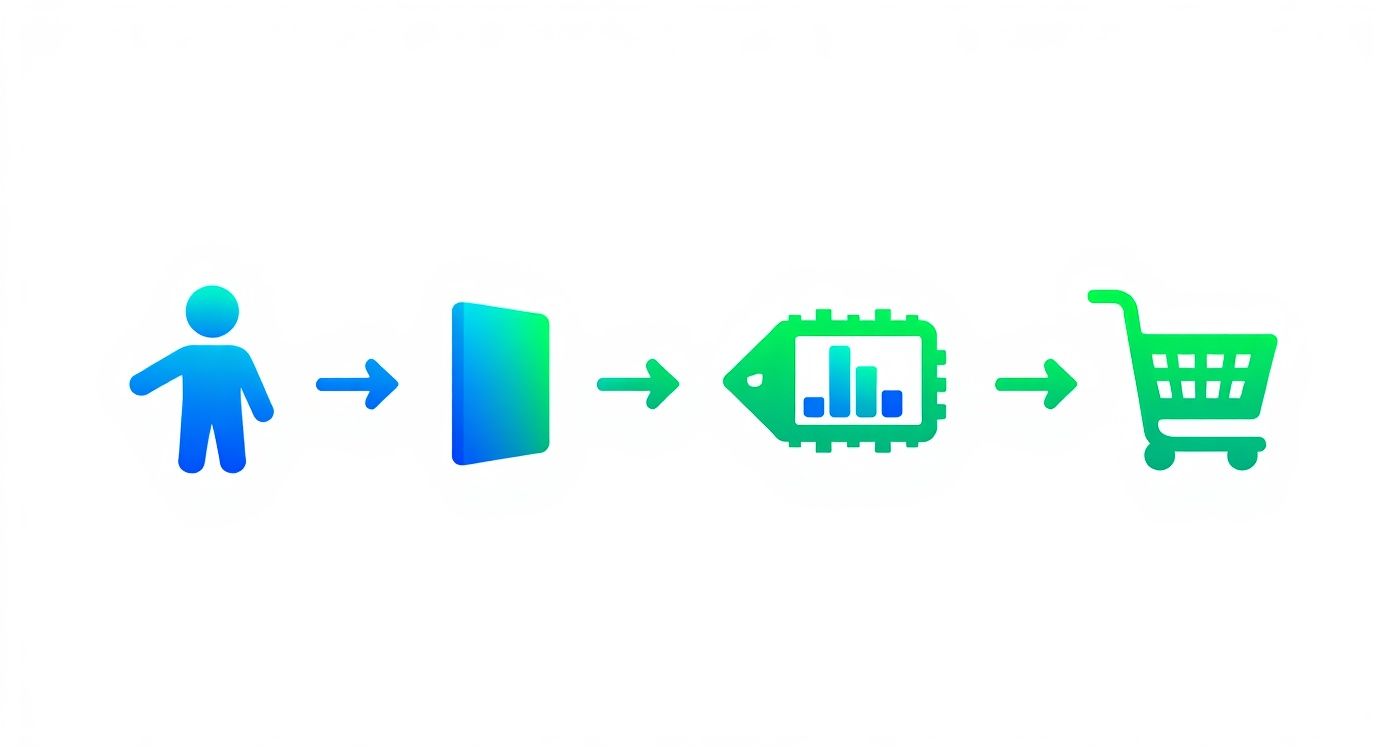
This kind of re-engagement gives you more opportunities to test what really brings people back and convinces them to convert.
Here’s a simple table to help you map out your ideas and figure out where to focus your energy first.
A/B Testing Priority Matrix
| Test Idea | Potential Impact (High/Med/Low) | Implementation Effort (High/Med/Low) | Priority Score |
|---|---|---|---|
| Change Homepage Headline | High | Low | Start Here |
| Revise CTA Button Text | High | Low | Start Here |
| Test a New Hero Image | Medium | Low | Good Next Step |
| Redesign Checkout Flow | High | High | Plan for Later |
| Change Footer Link Color | Low | Low | Low Priority |
| Rebuild Navigation Menu | Medium | High | Avoid for Now |
This matrix isn't foolproof, but it gives you a solid framework for turning a long list of "what ifs" into an actionable testing roadmap.
Choosing the Right Tools and Avoiding Pitfalls
Plenty of great tools are out there to help you run A/B tests. You can start with the free Google Optimize or look into more powerful platforms like VWO and Optimizely. These tools do the heavy lifting of splitting your traffic and tracking conversions, so you can focus on the strategy.
But even with the best software, it's easy to make mistakes that can completely invalidate your results. Here are two of the biggest traps people fall into:
-
Ending the Test Too Soon: It's so tempting to call a winner the second one version pulls ahead. Don't do it. You need to let your test run long enough to reach statistical significance—which is usually a 95% confidence level. This ensures your results aren't just a random fluke.
-
Testing Too Many Things at Once: A true A/B test changes only one element at a time. If you change the headline, the button color, and an image all in the same variation, you'll have no clue which change was actually responsible for the results. Keep it simple.
By creating solid hypotheses, prioritizing your tests, and steering clear of common errors, you can build a continuous optimization program where every experiment teaches you something valuable. That feedback loop is the engine that drives sustainable improvements to your website’s conversion rate.
Common Questions About Improving Conversion Rates
Even with a killer game plan, questions always pop up when you start digging into conversion rate optimization (CRO). It’s a field of continuous learning, so it's only natural to wonder about benchmarks, timelines, and the right tools for the job.
Let’s tackle some of the most common uncertainties marketers and business owners run into. The goal here is to give you direct, no-fluff answers that build on the strategies we've already covered.
What Is a Good Website Conversion Rate?
This is easily the most popular question, but the honest-to-goodness answer is: it depends. A "good" conversion rate is completely relative and can swing wildly based on a few key factors.
There’s no magic number that works for every website. Instead of getting hung up on some universal average, you need to look at your own context.
- Your Industry: An e-commerce store selling fun, low-cost gadgets might pull in a 3-5% conversion rate. On the other hand, a B2B company selling six-figure software might celebrate a 1% conversion rate as a massive win.
- Where Your Traffic Comes From: Someone who clicks through from a targeted email is way more likely to convert than a person who just stumbled onto your site from a broad social media ad.
- What You're Asking Them to Do: The conversion rate for a simple newsletter signup will always be higher than for a complex, multi-step purchase that requires a credit card.
While you’ll often hear people throw around the 2-5% range as a general benchmark, the only metric that truly matters is your own performance over time. A "good" rate is one that's consistently getting better month after month. Focus on beating your own baseline, not some random industry number.
How Long Does It Take to See CRO Results?
Patience is everything in conversion optimization. Sure, a tiny tweak like changing a button color might give you a small lift in a week, but the big, sustainable improvements take time. Think marathon, not a sprint.
Generally, you should plan for a timeline of at least 3 to 6 months to see meaningful results from a structured CRO program. That window gives you enough time to:
- Actually Gather Enough Data: You need a solid amount of traffic to run A/B tests that are statistically significant. Calling a test too early is just guessing, and you could end up making decisions based on random chance.
- Form and Test Smart Hypotheses: Good testing is a process. It involves analyzing user behavior, crafting a solid hypothesis, and then building out the test variant.
- Implement the Winners: Once you have a clear winner from a test, you still have to get those changes implemented on your live site, which takes development resources.
The real key is to see CRO as an ongoing cycle of improvement, not a one-and-done project. Every test, win or lose, gives you valuable insights that fuel the next one.
What Are the Best CRO Tools?
The right toolkit makes a huge difference, but you don’t need a dozen expensive platforms to get started. A solid CRO tech stack really just needs to cover three bases: analytics, user behavior, and testing.
Here are a few of the most effective tools the pros lean on:
| Tool Category | Example Tools | What It Does |
|---|---|---|
| Web Analytics | Google Analytics 4 | Gives you the hard numbers on traffic, user flow, and conversions. It tells you what is happening. |
| User Behavior | Hotjar, Crazy Egg | Shows you the why behind the numbers with heatmaps, session recordings, and on-site surveys. |
| A/B Testing | VWO, Optimizely | Lets you run controlled experiments to test different page versions and see which one performs better. |
If you're just starting out, a combination of Google Analytics and a user behavior tool like Hotjar is a powerhouse. That pairing alone will give you more than enough data to start forming strong, evidence-backed ideas for your first tests.
How Do I Know What to Test First?
With a million things you could test, figuring out where to start can feel paralyzing. The trick is to prioritize based on potential impact and how easy it is to implement. Zero in on your high-traffic pages that are absolutely critical to your conversion funnel.
A great mental model for this is the PIE framework:
- Potential: How much room for improvement does this page have? If you see high bounce rates or huge drop-offs in your funnel, that’s a big clue.
- Importance: How valuable is the traffic to this page? Your homepage, key service or product pages, and checkout process are almost always the most important.
- Ease: How simple will it be to set this test up? Start with low-hanging fruit like headlines and button text before you commit to a full page redesign.
Let your analytics be your guide. For instance, if a product page is getting tons of visitors but has a terrible "add to cart" rate, that’s your starting line. It's the perfect place to start testing everything from the product description and images to the call-to-action button itself.
Ready to stop guessing and start building a website that actually converts? The team at Site Igniters combines data-driven strategy with expert design and development to turn your traffic into measurable growth. We specialize in everything from SEO and web design to advanced AI solutions that drive real results. https://siteigniters.com
Seth Sanders is the founder of Site Igniters, a digital marketing agency in El Dorado Hills, California.